 HTML
HTML  CSS
CSS  PHP
PHP  JavaScript
  SQL
SQL  Bootstrap
  Solidity
  jQuery
  Git
Git  Chrome DevTools
  C++
C++  Python
 TL;DR – HTML responsive web design allows the website to adapt and be displayed equally well in various-sized screens.
Contents
Website Responsiveness
One of the reasons HTML5 was so revolutionary is that it allowed creating websites to be used across different platforms and browsers. Nowadays, mobile website design has the same level of importance (if not greater) as the usual design for computer screens.
Every modern website is expected to be user-friendly, i.e., easy to access and use on any device. To achieve that, you need to understand what is a responsive website:
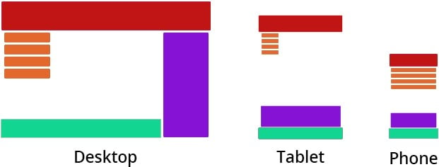
As you can see in the picture, it is often not enough to resize pictures and text according to the screen size and resolution. The main requirements for a responsive (or adaptive) design are readability and aesthetics of the layouts. Therefore, elements are sometimes moved around to create a better user experience.
- Easy to use with a learn-by-doing approach
- Offers quality content
- Gamified in-browser coding experience
- The price matches the quality
- Suitable for learners ranging from beginner to advanced
- Free certificates of completion
- Focused on data science skills
- Flexible learning timetable
- Simplistic design (no unnecessary information)
- High-quality courses (even the free ones)
- Variety of features
- Nanodegree programs
- Suitable for enterprises
- Paid Certificates of completion
- A wide range of learning programs
- University-level courses
- Easy to navigate
- Verified certificates
- Free learning track available
- University-level courses
- Suitable for enterprises
- Verified certificates of completion
Setting the Viewport
In HTML, viewport defines the area in the screen used for browsing the page. One of the methods to create a mobile website design is to set the viewport. This way, you can instruct the browser to adjust the size for different screens in your HTML code for website design.
Setting the viewport requires adding a <meta> element in your <head> section:
<meta name="viewport" content="width=device-width">
Note: you don't have to specify the device width necessarily: simply adding width=device-width matches the widths of the website and the screen.
In the table below, you will find all available properties for content listed and defined:
| Property | Definition |
|---|---|
| device-height | Device screen height |
| device-width | Device screen width |
| height | Virtual viewport height |
| initial-scale | Initial zoom (no zooming if set to 1.0) |
| maximum-scale | Strongest possible zoom (no zooming if set to 1.0) |
| minimum-scale | Weakest possible zoom (no zooming if set to 1.0) |
| user-scalable | Allows or forbids zooming |
| width | Virtual viewport width |
Understanding how to make a responsive website helps with optimizing your website for search engines as well. According to Google, any page optimized to be used on different-sized screens must include a meta viewport tag in its HTML code for website design.
What Is a Responsive Website: Useful Tips
- Make sure you don't use the HTML viewport on a non-responsive website: in such a case, the browser will zoom in the top left corner of the layout, and the user will have to manually zoom out to navigate.
- Avoid using images with fixed dimensions, as they will not adapt as well as relative units (percentages).
- Take a step further and learn to send CSS media queries for better responsiveness. By allowing you to check for specific conditions, they allow applying different styling for various devices.
