 HTML
HTML  CSS
CSS  PHP
PHP  JavaScript
  SQL
SQL  Bootstrap
  Solidity
  jQuery
  Git
Git  Chrome DevTools
  C++
C++  Python
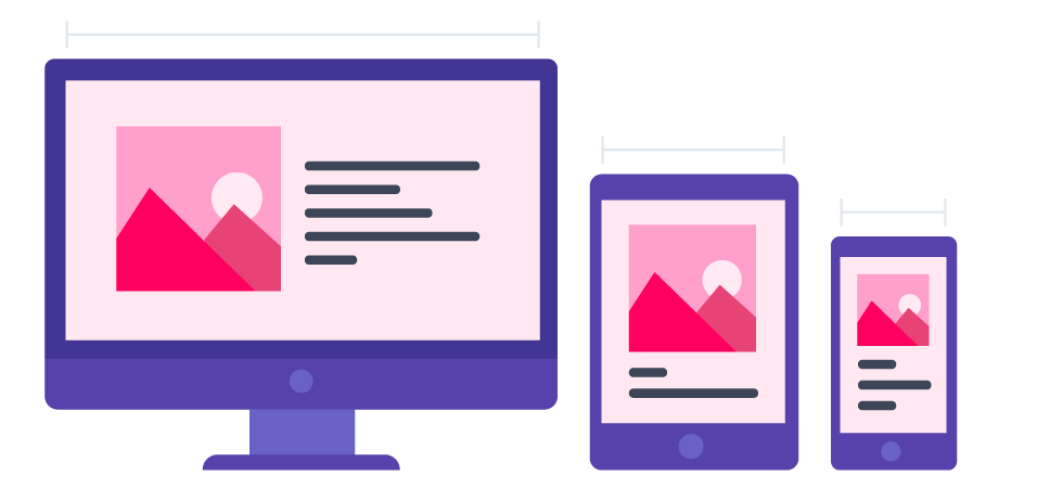
TL;DR – CSS media queries and breakpoints are for creating responsive media designs that make page layouts adapt to different screens.
Contents
- 1. Use of Media Queries
- 1.1. How to Write a @media Rule
- 1.2. Components of Media Queries
- 1.3. Logical Operators
- 2. Breakpoints for Devices and Content
- 3. Flexible Image Gallery
- 4. Use of min or max-width
- 5. Always Design for Mobile Devices First
- 6. Typical Breakpoints
- 7. Orientation: Portrait vs. Landscape
- 8. Hidden Elements
- 9. Changing Font Size
- 10. Responsive Media: Useful Tips
Use of Media Queries
CSS media queries are for developing responsive media designs. They let you control the way websites look on different screens.
This example changes the background color based on the specific size dimensions of mobile devices (992px for tablets and 600px for phones):
/* The background color is set to green */
body {
  background-color: lightgreen;
}

/* When a screen is 992px or smaller, the background color will be pink */
@media screen and (max-width: 992px) {
  body {
    background-color: pink;
  }
}

/* When a screen is 600px or smaller, the background color will be blue */
@media screen and (max-width: 600px) {
  body {
    background-color: lightblue;
  }
}
To guarantee the best user experience, you need to make sure that your pages adjust to screen sizes, device-orientations, or display-densities.
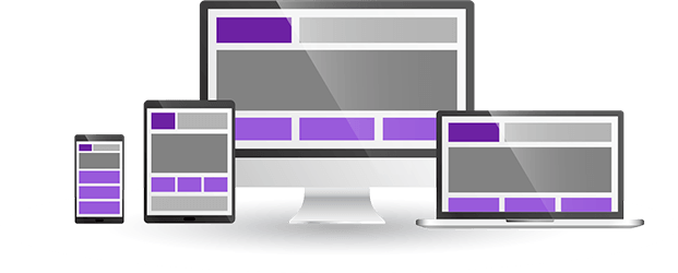
CSS @media at-rule sets specific CSS properties to style websites only when conditions are met. For instance, the @media can indicate that the layout changes when pages load on mobile devices, tablets, desktops, or laptops.
Here is an example of a responsive website reacting to different sizes of windows:
/* Create two unequal columns */
/* Sidebar/left column */
.sidecol {
    flex: 30%;
    background-color: #f1f1f1;
    padding: 20px;
}

/* Main column */
.maincol {
    flex: 70%;
    background-color: white;
    padding: 20px;
}
How to Write a @media Rule
This example sets a simple responsive design. It responds when the screen reaches 600px. The background color changes for smaller screens:
@media only screen and (max-width: 600px) {
    body {
        background-color: blue;
    }
}
In this example, we use media queries with CSS max-width and float properties to create a responsive navigation menu:
.navbar {
    overflow: hidden;
    background-color: lightgreen;
}

.navbar a {
    float: left;
    display: block;
    color: black;
   text-align: center;
   padding: 14px 16px;
   text-decoration: none;
}

@media screen and (max-width: 600px) {
    .topnav a {
        float: none;
        width: 100%;
    }
}Using @media rule paired with CSS max-width, we can change the alignment of elements by applying different float and width properties:
@media screen and (min-width: 720px) and (max-width: 1079px) /* Four columns that float next to each other */
.column {
  float: left;
  width: 25%;
}

/* If a screen is 992px or less wide, keep two columns */
@media screen and (max-width: 992px) {
  .column {
    width: 50%;
  }
}

/* If a screen is 600px or less wide, stack the columns on top of each other instead of next to each other */
@media screen and (max-width: 600px) {
  .column {
    width: 100%;
  }
}.row {
display: flex;
flex-wrap: wrap;
}
/* Four equal columns */
.column {
flex: 25%;
padding: 20px;
}
/* If a screen is 992px or less wide, keep two columns */
@media screen and (max-width: 992px) {
.column {
flex: 50%;
}
}
/* If a screen is 600px or less wide, stack the columns on top of each other instead of next to each other */
@media screen and (max-width: 600px) {
.row {
flex-direction: column;
}
}The example below shows a menu that floats to the left of the page when the viewport reaches 600 pixels or more. Otherwise, it will appear on top:
@media screen and (min-width: 600px) {
    #leftsidebar {
        width: 220px;
        float: right;
    }
    #main {
        margin-right: 250px;
    }
}Components of Media Queries
A media query consists of the media type and media feature.
Media types indicate the category of devices and have the following values:
all: suitable for all devices.print: suitable for data presented in the print preview mode.screen: suitable primarily for screens.speech: suitable for speech synthesizers.
Media features are optional expressions that indicate whether they are found in a page. Here are some of the common values:
width: sets the targeted width of the display area.height: sets the targeted height of the display area.orientation: sets the targeted orientation of devices.resolution: sets the targeted resolution of the output device.
Logical Operators
You can create advanced CSS media queries by using logical operators and, only and not. Developers combine several media queries by separating them by commas.
and: combines several media features. Both need to be true.only: applies styling properties only if the entire query matches.not: negates a media query by delivering true when the response should have been false.
Breakpoints for Devices and Content
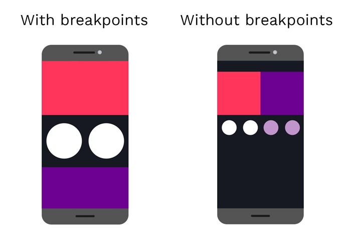
CSS breakpoints are a huge part of responsive designs. You use breakpoints with media queries to set points where websites adjust to the width of devices. Therefore, you can control the layout of websites and change them according to users' devices.
In this example, we add a breakpoint at 768 px:
/* Design for desktop */
.col-1 {width: 8.33%;}
.col-2 {width: 16.66%;}
.col-3 {width: 25%;}
.col-4 {width: 33.33%;}
.col-5 {width: 41.66%;}
.col-6 {width: 50%;}
.col-7 {width: 58.33%;}
.col-8 {width: 66.66%;}
.col-9 {width: 75%;}
.col-10 {width: 83.33%;}
.col-11 {width: 91.66%;}
.col-12 {width: 100%;}

@media only screen and (max-width: 768px) {
    /* Design for mobile */
    [class*="col-"] {
        width: 100%;
    }
}
There are CSS breakpoints for adjusting website layout and appearance according to devices.
Tip: developers no longer recommend device-based breakpoints as they result in long code and the constant need for updates (when new devices appear).
A better option is to add content-based breakpoints to indicate the place in your content that needs to respond to changes in screens.
Flexible Image Gallery
To make your image gallery responsive, you need to use a combination of CSS styling properties like flex, vertical-align, and max-width.
In our example, the original four columns become two columns or even a single column on the smallest screens:
/* Four equal columns */
.column {
    flex: 25%;
    max-width: 25%;
    padding: 0 4px;
}

.column img {
    margin-top: 8px;
   vertical-align: middle;
}

/* If a screen is 800px or less wide, keep two columns */
@media screen and (max-width: 800px) {
    .column {
        flex: 50%;
        max-width: 50%;
    }
}

/* If a screen is 600px or less wide, stack the columns on top of each other instead of next to each other */
@media screen and (max-width: 600px) {
    .column {
        flex: 100%;
        max-width: 100%;
    }
}
- Easy to use with a learn-by-doing approach
- Offers quality content
- Gamified in-browser coding experience
- The price matches the quality
- Suitable for learners ranging from beginner to advanced
- Free certificates of completion
- Focused on data science skills
- Flexible learning timetable
- Simplistic design (no unnecessary information)
- High-quality courses (even the free ones)
- Variety of features
- Nanodegree programs
- Suitable for enterprises
- Paid Certificates of completion
- A wide range of learning programs
- University-level courses
- Easy to navigate
- Verified certificates
- Free learning track available
- University-level courses
- Suitable for enterprises
- Verified certificates of completion
Use of min or max-width
It is standard to set CSS breakpoints by adding CSS max-width or min-width. Beginners should learn that min-width is for setting breakpoints for mobile devices. In your code, you need to start by indicating the properties for smaller screens and then set the styles for the bigger ones.
Note: if your priority is larger screens, you should use the CSS max-width.
In some cases, an element needs to change appearance when the screen dimensions are very particular – more than x and less than y.
Assigning both min-value and max-value properties to a single @media rule allows you to determine these specific style conditions.
@media screen and (max-width: 950px) and (min-width: 625px) {
  div.example {
    font-size: 45px;
    padding: 55px;
    border: 6px solid yellow;
    background: lightgrey;
  }
}Always Design for Mobile Devices First
Designing responsive media for mobile devices makes the pages load faster on smaller screens.
/* Design for mobile */
[class*="col-"] {
    width: 100%;
}

@media only screen and (min-width: 769px) {
    /* Design for desktop */
    .col-1 {width: 8.33%;}
    .col-2 {width: 16.66%;}
   .col-3 {width: 25%;}
   .col-4 {width: 33.33%;}
   .col-5 {width: 41.66%;}
   .col-6 {width: 50%;}
   .col-7 {width: 58.33%;}
   .col-8 {width: 66.66%;}
   .col-9 {width: 75%;}
   .col-10 {width: 83.33%;}
   .col-11 {width: 91.66%;}
   .col-12 {width: 100%;}
}
We change the web design when the width is larger than 768px. So min-width must be 769px. This breakpoint is a characteristic of the mobile-first approach.
Typical Breakpoints
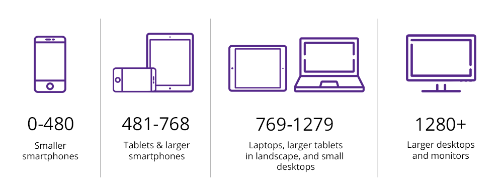
You can add as many CSS breakpoints as you need to guarantee that web pages respond to different screen sizes.
/* For devices with width of 480px and less, like phones */
@media only screen and (max-width: 480px) {...}

/* For devices with width between 481px and 768px, like larger phones and portrait tablets */
@media only screen and (min-width: 481px) {...}

/* For devices with width between 769px and 1279px, like landscape tablets and laptops */
@media only screen and (min-width: 769px) {...}

/* For devices with width of 1280px and more, like desktop computers */
@media only screen and (min-width: 1280px) {...}
This example adds a CSS @media query (at 481px) and defines new classes for a screen larger than 480px and smaller than 769 px:
/* Design for mobile */
[class*="col-"] {
    width: 100%;
}

@media only screen and (min-width: 481px) {
    /* Design for tablets */
    .col-m-1 {width: 8.33%;}
    .col-m-2 {width: 16.66%;}
   .col-m-3 {width: 25%;}
   .col-m-4 {width: 33.33%;}
   .col-m-5 {width: 41.66%;}
   .col-m-6 {width: 50%;}
   .col-m-7 {width: 58.33%;}
   .col-m-8 {width: 66.66%;}
   .col-m-9 {width: 75%;}
   .col-m-10 {width: 83.33%;}
   .col-m-11 {width: 91.66%;}
   .col-m-12 {width: 100%;}
}

@media only screen and (min-width: 769px) {
    /* Design for desktop */
   .col-1 {width: 8.33%;}
   .col-2 {width: 16.66%;}
   .col-3 {width: 25%;}
   .col-4 {width: 33.33%;}
   .col-5 {width: 41.66%;}
   .col-6 {width: 50%;}
   .col-7 {width: 58.33%;}
   .col-8 {width: 66.66%;}
   .col-9 {width: 75%;}
   .col-10 {width: 83.33%;}
   .col-11 {width: 91.66%;}
   .col-12 {width: 100%;}
}
The classes are identical, but HTML can decide how columns react to each breakpoint.
<div class="row">
   <div class="col-4 col-m-4">...</div>
   <div class="col-7 col-m-10">...</div>
   <div class="col-4 col-m-13">...</div>
</div>
Orientation: Portrait vs. Landscape
You can make the design responsive to the screen orientation. Specify the CSS style properties that will apply when the browser window is either in the portrait or landscape mode.
This example uses media queries and breakpoints to change the background color when the screen orientation is landscape:
@media only screen and (orientation: landscape) {
    body {
        background-color: blue;
    }
}
Hidden Elements
CSS media queries can hide elements when certain criteria are true.
Mobile web users spend more time finding information on small screens. You can help them have a better experience by hiding the non-essential elements.
You need to set the display property to none when the width of browser windows gets smaller than a certain @media breakpoint, for example, 600px:
@media only screen and (max-width: 600px) { /* The element will be hidden if the screen is 600px wide or less */
  div.example {
    display: none;
  }
}
Changing Font Size
CSS media queries also adjust the font size based on the screen size. Making information easy-to-read is one of the major goals of any responsive website.
Check the following example to learn to use the font-size property together with @media rule and CSS width.
@media only screen and (min-width: 481px) { /* Font size of div elements will be 70px when the screen is 481px or wider */
   div.example {
      font-size: 70px;
   }
}

@media only screen and (max-width: 480px) { /* If the screen is 480px or less, the font of div elements will be 25px */
   div.example {
      font-size: 25px;
  }
}
