 HTML
HTML  CSS
CSS  PHP
PHP  JavaScript
  SQL
SQL  Bootstrap
  Solidity
  jQuery
  Git
Git  Chrome DevTools
  C++
C++  Python
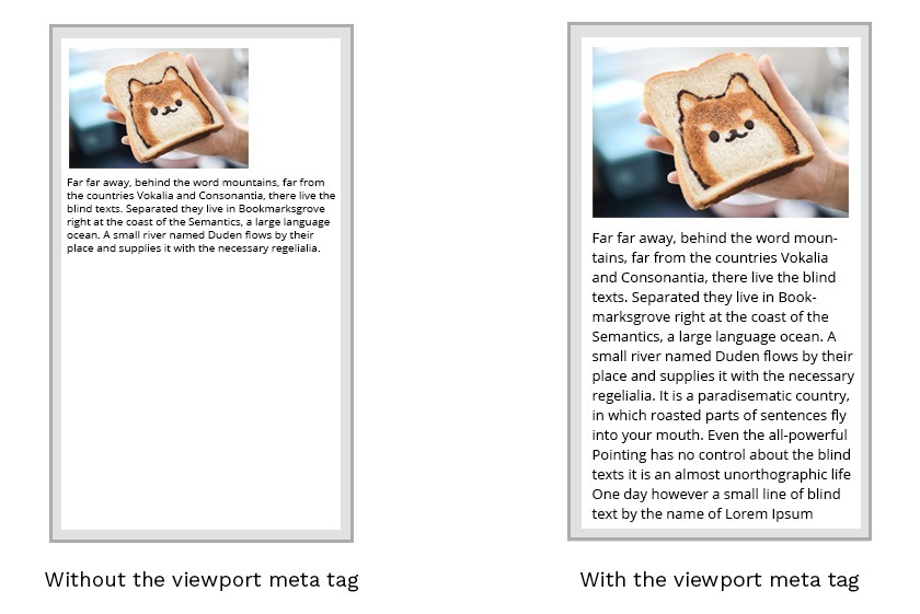
 TL;DR — CSS viewport is the zone in a browser window that is visible at once without scrolling. Setting up the CSS <meta> viewport tag is the most effective way to improve how web pages look on smaller screens.
The concept of the viewport
The CSS viewport refers to the part of the website, which is visible in the browser window. Therefore, the viewport is usually not the same size as the actual page. Mobile phones and other devices with smaller screens display pages in a virtual window or viewport.
The main issue is that narrower screens make the virtual viewport shrink to display all areas of a web page. Therefore, some websites do not look good on mobile devices.
Manipulating the viewport
You might assume that setting media queries is enough to fix this issue. However, they might not help if the virtual viewport does not match the specified breakpoints.
Therefore, you should consider setting the meta viewport tag for changing the size and scaling viewports.
width=device-widthpart of the tag sets the width of the page to respond to the width of the screen.initial-scale=1.0part of the tag sets the initial zoom level of the page.
This example uses the <meta> viewport tag:
<meta name="viewport" content="width=device-width, initial-scale=1.0">
These settings tell the browsers to display a website at the width of the screen of the device used. Therefore, if the screen width is 320px, the browser window will be the same.
Note: if your website is not created to be responsive, you should not use the viewport
<meta>tag since it might create issues.
The CSS <meta> viewport tag accepts the following properties:
| Property | Description |
|---|---|
| height | Sets the height of the virtual device viewport. |
| width | Sets the width of the virtual device viewport. |
| initial-scale | Sets the zoom level for when the page is first opened. |
| minimum-scale | Sets the minimum zoom level that the user can zoom. |
| maximum-scale | Sets the maximum- zoom level that the user can zoom. |
| user-scalable | Sets a flag that lets the device to zoom in and out. |
Mobile browsers manage the orientation changes differently. Mobile Safari simply zooms pages when the orientation changes to landscape. If you wish to keep settings of scale CSS, include the maximum-scale=1> value to prevent this behavior of mobile browsers.
