 HTML
HTML  CSS
CSS  PHP
PHP  JavaScript
  SQL
SQL  Bootstrap
  Solidity
  jQuery
  Git
Git  Chrome DevTools
  C++
C++  Python
 TL;DR — The CSS flexbox layout is a one-dimensional layout system, meaning that it handles either rows or columns, not both. The purpose of flexbox is to align and position elements in a container. The flex container controls elements to avoid overflow or excessive space.
Contents
- 1. Introduction to flexbox
- 1.1. Flexbox axis
- 2. Flex containers
- 2.1. Flex-direction
- 2.2. Flex-wrap
- 2.3. Flex-flow
- 2.4. Justify-content
- 2.5. Align-items
- 2.6. Justify-content and align-items
- 2.7. Align-content
- 3. Flex items
- 3.1. Order
- 3.2. Flex-grow
- 3.3. Flex-shrink
- 3.4. Flex-basis
- 3.5. Flex
- 3.6. Align-self
- 4. CSS flexbox: useful tips
- 5. Browser support
Introduction to flexbox
The structure of a flexible layout is based on dividing elements to containers (parent elements) and items (child elements).
The following example creates a basic CSS flexbox.
.flex-container {
  display: flex;
  flex-wrap: nowrap;
}

.flex-item {
  width: 100px;
  margin: 10px;
}
The next example creates a responsive image gallery.
.flex-container {
  display: flex;
  flex-direction: row;
  flex-wrap: wrap;
  margin-bottom: 25px;
}
.flex-item {
  background-color: lightgray;
  background-position: center center;
  background-size: cover;
  margin: 2px;
  flex: auto;
  height: 240px;
  flex-basis: 150px;
}
This example shows the use of CSS flexbox to create a responsive website layout.
<iframe src="https://www.bitdegree.org/learn/" height="500" style="width: 100%; border: 1px solid #eee;"></iframe>
Remember: the CSS flexbox is one-dimensional. Therefore, it does not lay out items on both vertical and horizontal dimensions simultaneously.
Assigning properties to the parent element is more productive than assigning them to each child element individually. These properties allow organizing items inside the container (some apply to parent elements; others apply to the children).
The CSS flexbox can control the following aspects of the layout:
- The direction to which the items are displayed
- The wrapping of items when the window is resized
- The Justification of items and space in between
- The vertical alignment of items
- The alignment of lines of items
- The order of items in a line
- The items' ability to grow or shrink when the window resizes
- The alignment of an individual item
Flexbox axis
The CSS flexbox has two axes: the main and the cross.
- You define the main axis with the
flex-directionproperty. It has four possible values: row, row-reverse, column, and column-reverse.
Note: when set to row or row-reverse, the main axis moves along the row inline. column and column-reserve move from the top to bottom.
- Cross axis always goes perpendicular ( ⟂ ) to the main axis. If the main axis has a
roworrow-reversedirection, the cross axis runs along acolumnorcolumn-reversedirection (and vice versa).
Note: understanding the axes of CSS flexbox is essential as CSS align and justifies flex items along them.
Flex containers

The CSS flex container is the element that has a display property set to either flex or inline-flex. Then, all children of the container become flex items.
Therefore, the CSS flex container defines the size, alignment, and position for its children.
Tip: the children of both inline-flex container and block flex container behave the same. The flex container either expands items to fill available space or makes them smaller to avoid overflow.
Every flex container initially has these default values:
-
flex-direction: row -
justify-content: flex-start -
align-items: stretch -
align-content: stretch -
flex-basis: auto -
flex-wrap: nowrap
The container distributes its items in a row, and the size of content determines their size on the main axis. When there are more items than the container can have, they overflow (not wrap). Also, if some items have a bigger height than others, smaller items stretch to fit the highest item.
Note: other properties don't have default values. If you do not set them, CSS won’t apply them to your container.
This flexbox cheat sheet explains all of the properties for controlling the flex container.
Flex-direction
The CSS flex-direction property sets the position of flex items and the direction along which the main axis moves.
Based on the specified direction (row or column), the main axis is either horizontal or vertical. It also automatically sets the cross axis, which is the perpendicular ( ⟂ ) axis to the main axis.

The following CSS flex examples show how flex-direction changes the flex container and its items:
flex-direction: column – the direction of flex items is from top to bottom.
.flex-container { display: flex; flex-direction: column; }
.flex-item { width: 100px; margin: 10px; }
flex-direction: column-reverse – the direction of flex items is from bottom to top.
.flex-container { display: flex; flex-direction: column-reverse; } .flex-item { width: 100px; margin: 10px; }
flex-direction: row (default) – the direction of flex items is from left to right.
.flex-container { display: flex; flex-direction: row; }
.flex-item { width: 100px; margin: 10px; }
flex-direction: row-reverse – the direction of flex items is from right to left.
.flex-container { display: flex; flex-direction: row-reverse; }
.flex-item { width: 100px; margin: 10px; }
Flex-wrap
The CSS flex-wrap property defines how the container behaves when it has too many items. The possible flex-wrap values are nowrap, wrap, and wrap-reverse.
Note: the flex-wrap property determines whether overflow should be wrapped or not. If this property is not set, elements overflow the container by default.
The following CSS flex examples illustrate each of the flex-wrap values in action.
flex-wrap: wrap – the items wrap to the next line (from top to bottom, left to right).
.flex-container { display: flex; flex-wrap: wrap; }
.flex-item { width: 100px; margin: 10px; }
flex-wrap: nowrap (default) – the items don’t wrap. Instead, they shrink or overflow the container.
.flex-container { display: flex; flex-wrap: nowrap; }
.flex-item { width: 100px; margin: 10px; }
flex-wrap: wrap-reverse – the items wrap in the reverse direction, from bottom to top (the last item wraps to the line above).
.flex-container { display: flex; flex-wrap: wrap-reverse; }
.flex-item { width: 100px; margin: 10px; }
Flex-flow
The CSS flex-flow is the shorthand property to specify flex-direction and flex-wrap in one declaration. Using this shorthand, you define both the main and cross axis for the flex container.
The default value of flex-flow is the combination of default values of the two properties.
The example below shows how the flex-flow: row nowrap declaration works:
.flex-container { display: flex; flex-flow: row wrap; }
.flex-item { width: 100px; margin: 10px; }
Justify-content
The justify-content sets how browsers handle space surrounding and between elements along the main axis.
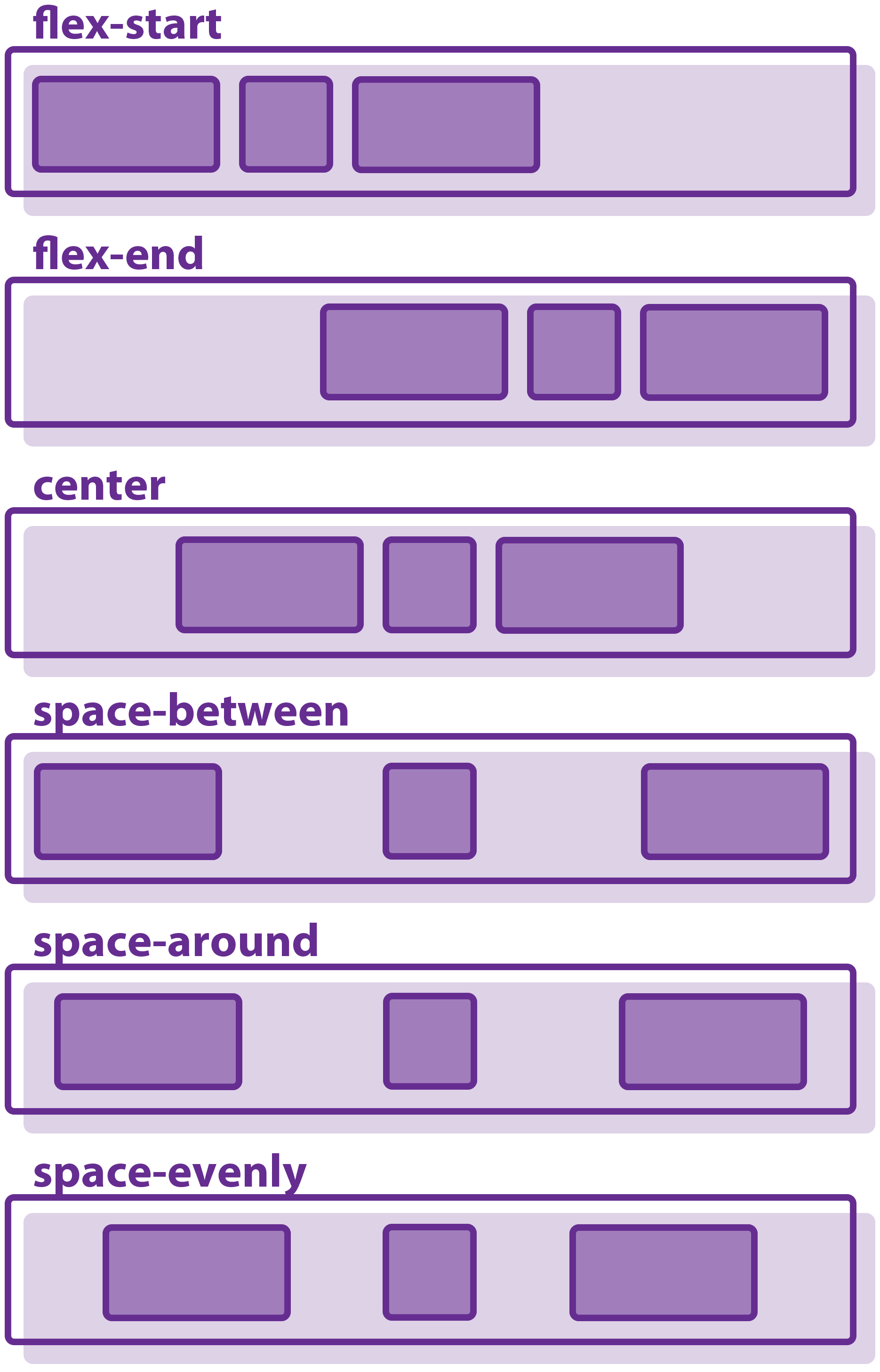
The available values for this property are flex-start, flex-end, center, space-between, space-around, space-evenly.
The flexbox examples below show how each property works.
justify-content: flex-start (default) – aligns the content towards the start of a flex container.
.flex-container { display: flex; justify-content: flex-start; }
.flex-item { width: 100px; margin: 10px; }
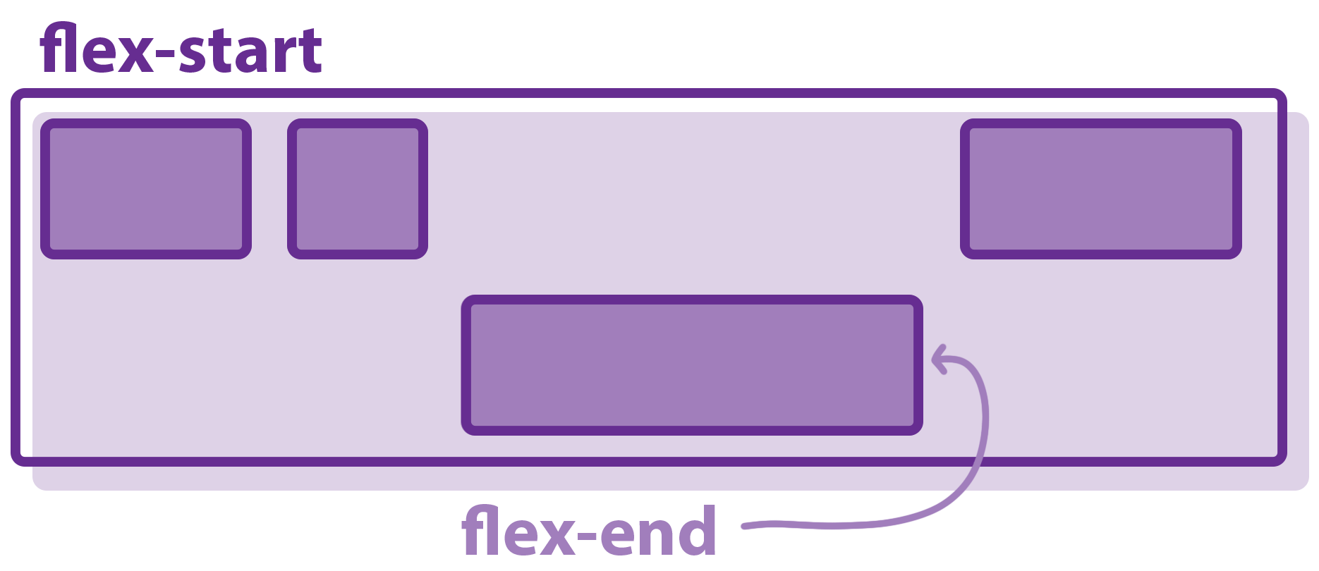
justify-content: flex-end – aligns the content towards the end of a flex container.
.flex-container { display: flex; justify-content: flex-end; }
.flex-item { width: 100px; margin: 10px; }
justify-content: center – places items at the center of the main axis.
.flex-container { display: flex; justify-content: center; }
.flex-item { width: 100px; margin: 10px; }
justify-content: space-between – distributes items and the spaces between them evenly. The first item sticks to the start of the line. The last item sticks to the end of the line.
.flex-container { display: flex; justify-content: space-between; }
.flex-item { width: 100px; margin: 10px; }
justify-content: space-around – distributes items evenly, with equal spaces around each of them.
.flex-container { display: flex; justify-content: space-around; }
.flex-item { width: 100px; margin: 10px; }
Note: the first and last spaces are not equal to all the other spaces between items. It is not an error: the first item has only one unit of space to the left border, but on the right, its space sums up with the left space of the second item. The same goes for the last item.
Align-items
You can make flexbox align items by using the align-items property.
It is different from justify-content since instead of the main axis, it aligns items along the cross axis. It deals with a single line at once.
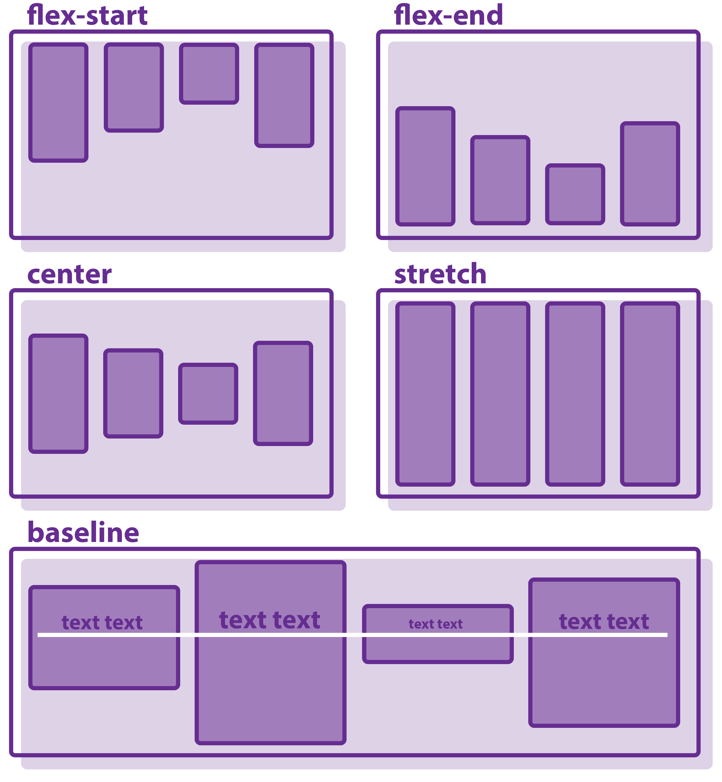
The possible align-items values are flex-start, flex-end, center, baseline, stretch.
The following examples show how a flexible layout becomes with the flexbox align-items property.
align-items: flex-start – distributes items towards the start of the cross axis.
.flex-container { display: flex; align-items: flex-start; }
.flex-item { width: 100px; margin: 10px; }
align-items: flex-end – distributes items towards the end of the cross axis.
.flex-container { display: flex; align-items: flex-end; }
.flex-item { width: 100px; margin: 10px; }
align-items: center – places items at the center of the cross axis.
.flex-container { display: flex; align-items: center; }
.flex-item { width: 100px; margin: 10px; }
align-items: stretch (default) – increases the items to fill the container, but does not overrule the min-width/max-width properties of individual items.
.flex-container { display: flex; align-items: stretch; }
.flex-item { width: 100px; margin: 10px; }
align-items: baseline – aligns items along their baseline of content (the line upon which most letters sit). Baseline depends on the tallest item in a line.
.flex-container { display: flex; align-items: baseline; }
.flex-item { width: 100px; margin: 10px; }
Justify-content and align-items
CSS has been notorious for failing to provide easy ways to center elements. However, the CSS flexbox can center one or multiple items in the center of a container. You can center elements by setting both justify-content and align-items to center.
Note: the
justify-content: centerdeclaration centers the item in respect to the main axis, andalign-items: centercenters the item along the cross axis.
Therefore, the item appears in the center of both dimension:
.flex-container { display: flex; align-items: center; justify-content: center; }
.flex-item { width: 100px; margin: 10px;}
- Easy to use with a learn-by-doing approach
- Offers quality content
- Gamified in-browser coding experience
- The price matches the quality
- Suitable for learners ranging from beginner to advanced
- Free certificates of completion
- Focused on data science skills
- Flexible learning timetable
- Simplistic design (no unnecessary information)
- High-quality courses (even the free ones)
- Variety of features
- Nanodegree programs
- Suitable for enterprises
- Paid Certificates of completion
- A wide range of learning programs
- University-level courses
- Easy to navigate
- Verified certificates
- Free learning track available
- University-level courses
- Suitable for enterprises
- Verified certificates of completion
Align-content
The CSS align-content property is similar to align-items, but it aligns lines of items within a container. It works along the cross axis.
The possible align-content values are: flex-start, flex-end, center, stretch, space-between, space-around.
Note: if there is only one line of items in a container, this property won't work.
The examples below demonstrate in detail how the align-content property behaves with different values.
align-content: flex-start – distributes lines towards the start of the container.
.flex-container { display: flex; flex-wrap: wrap; align-content: flex-start; }
.flex-item { width: 100px; margin: 10px; }
align-content: flex-end – distributes lines towards the end of the container.
.flex-container { display: flex; flex-wrap: wrap; align-content: flex-end; }
.flex-item { width: 100px; margin: 10px; }
align-content: center – distributes lines at the center of the container.
.flex-container { display: flex; flex-wrap: wrap; align-content: center; }
.flex-item { width: 100px; margin: 10px; }
align-content: stretch (default) – stretches the lines to use all available space of the container.
.flex-container { display: flex; align-content: strech; flex-wrap: wrap; }
.flex-item { width: 100px; margin: 10px; }
align-content: space-between – distributes lines evenly according to the flex direction (the first line at the start, last – at the end of the container).
.flex-container { display: flex; align-content: space-between; flex-wrap: wrap; }
.flex-item { width: 100px; margin: 10px;}
align-content: space-around – distributes lines evenly, keeping the spaces around lines equal.
.flex-container { display: flex; align-content: space-around; flex-wrap: wrap; }
.flex-item { width: 100px; margin: 10px; }
Flex items
The CSS flex item is a direct child of the flex container. Once you set an element as the container, its children become flex items automatically.

There are five properties (and one shorthand) that target individual flex items. They give you more control over separate elements without overriding the rules of the whole flex container layout.
By default, three of the properties have initial values:
flex-grow: 0flex-shrink: 1flex-basis: auto
With these values, the flex items do not expand to fill the available space on the main axis. However, flex items shrink when the flex container is smaller than necessary.
Setting the flex-basis value auto means that the item is big enough to fit its content. If flex items fill the flex container, but one item has significantly more content than others, it will get more space to fit everything. This default setting ensures the best possible layout:
.flex-container { display: flex; }
.flex-item { width: 100px; margin: 10px; }
This flexbox cheat sheet discusses all of the properties for handling flex items.
Order
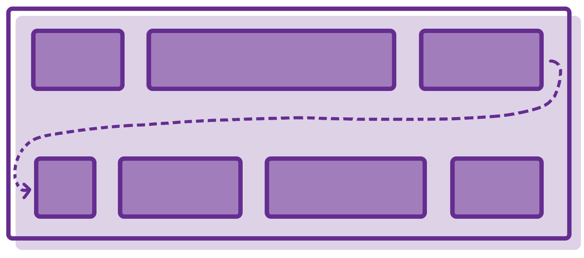
By default, flex items in the container appear in the same order in which they come in code (source order). You can change this sequence with the order property.
You have to assign a negative or positive number as its value. According to these numbers, the items will be re-ordered. The lowest numbers go first (negative value goes before 0 and positive numbers).
The following example shows the CSS flex item order property in action.
<div class="flex-container">
	<div style="order: 2">1</div>
	<div style="order: 3">2</div>
	<div style="order: 1">3</div>
	<div style="order: 5">4</div>
	<div style="order: 4">5</div>
</div>
Note: if multiple items have the same number as their
ordervalue, they line up based on the source order.
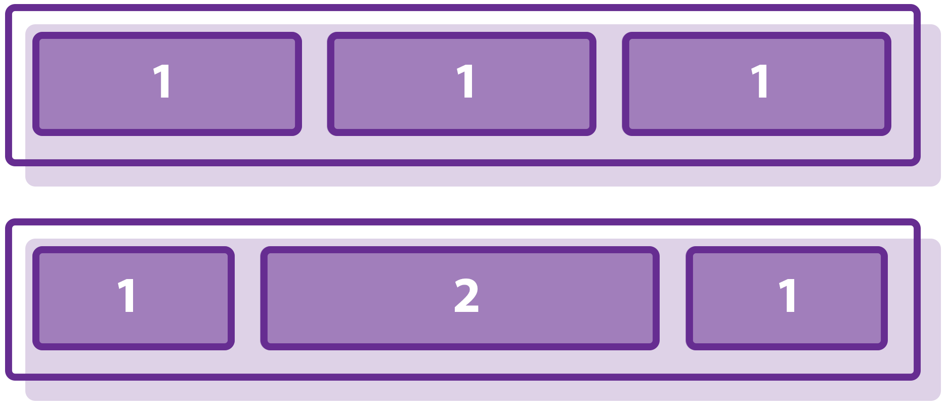
Flex-grow
The flex-grow property defines how much a flex item expands in relation to other items (if there is available space for that). You set its value using positive numbers without units. The number represents a proportion.
For instance, if you assign flex-grow: 2 to a flex item, it will expand twice as big compared to the rest of items in the same flex container.
Note: Negative numbers don’t work for this property.
In the following example, the first item will grow four times bigger than the rest, and the second item will grow two times bigger than the rest when there is available space for that.
<div class="flex-container">
	<div class="flex-item" style="flex-grow: 4">1</div>
	<div class="flex-item" style="flex-grow: 2">2</div>
	<div class="flex-item" style="flex-grow: 1">3</div>
	<div class="flex-item" style="flex-grow: 1">4</div>
	<div class="flex-item" style="flex-grow: 1">5</div>
</div>
Flex-shrink
The CSS flex-shrink property is similar to flex-grow. However, flex-shrink defines the proportion in which a flex item shrinks more than other items in that container (when there is not enough space to keep the original size).
Therefore, flex-shrink decreases the size of items to make them fit into the container.
Note: negative numbers don’t work with this property.
The next example demonstrates how flex-shrink works. We set the first item to shrink twice as much compared to the other items.
<div class="flex-container">
	<div class="flex-item" style="flex-shrink: 2">1</div>
	<div class="flex-item">2</div>
	<div class="flex-item">3</div>
	<div class="flex-item">4</div>
	<div class="flex-item">5</div>
</div>
Flex-basis
The flex-basis property defines the initial size of a flex item. It accepts length units or percentages.
You can also use value auto (which is the default value). It considers the source length of an item to be its flex-basis value. If length is not set in the code, the content of the item determines its length.
Keywords as values are also available. However, some of them are deprecated, and the few that do work (like max-content, min-content, and fit-content) have poor browser support.
Note: this property does not work with negative values.
The following example will help you understand the concept of flex-basis better.
<div class="flex-container">
	<div class="flex-item" style="flex-basis: 250px">1</div>
	<div class="flex-item">2</div>
	<div class="flex-item">3</div>
	<div class="flex-item">4</div>
	<div class="flex-item">5</div>
</div>
Flex
The flex property is a shorthand for defining all item properties related to the item size in one declaration.
The shorthand describes the flex-grow, flex-shrink, and flex-basis (the values must go in this exact order) properties.
The default setting is flex: 0 1 auto.
- 0 means the item won’t expand to fill the container when there is extra space.
- 1 specifies that it will be shrinking in the same proportion as other items when space gets smaller.
- Lastly,
automeans that the initial length of the item is the same as in the source code.
Analyze the following example to see how easy using flex is:
<div class="flex-container">
	<div class="flex-item">1</div>
	<div class="flex-item">2</div>
	<div class="flex-item" style="flex: 1 0 50px">3</div>
	<div class="flex-item">4</div>
	<div class="flex-item">5</div>
</div>
Align-self
The align-self property replaces the values of align-items with new ones for the item in the container. The property aligns items on the cross axis.
It can have the same values as align-items: flex-start, flex-end, center, baseline, stretch.
See the following flexbox examples to see align-self in action. The first one does not have align-items (it is stretch by default). However, items #2 and #4 have align-self: center.
<div class="flex-container">
	<div class="flex-item">1</div>
	<div class="flex-item" style="align-self: center">2</div>
	<div class="flex-item">3</div>
	<div class="flex-item" style="align-self: center">4</div>
	<div class="flex-item">5</div>
</div>
The second example shows five flex items that should stretch to fill the height of the flex container. However, item #2 has the align-self: flex-start property and item #4 has the align-self: flex-end property.
<div class="flex-container">
	<div class="flex-item">1</div>
	<div class="flex-item" style="align-self: flex-start">2</div>
	<div class="flex-item">3</div>
	<div class="flex-item" style="align-self: flex-end">4</div>
	<div class="flex-item">5</div>
</div>
CSS flexbox: useful tips
- CSS grid layout is similar to flexbox. Remember that the grid is a better option for large-scale layouts, while flexbox is better for small-scale ones.
- Since the flexbox has better support in older browsers, you can use it as a fallback function for the grid.
Browser support
Chrome
Edge
Firefox
IE
Opera
Safari
Mobile browser support
Chrome
Firefox
Opera
