 HTML
HTML  CSS
CSS  PHP
PHP  JavaScript
  SQL
SQL  Bootstrap
  Solidity
  jQuery
  Git
Git  Chrome DevTools
  C++
C++  Python
 TL;DR — CSS mobile-friendly design uses CSS flexbox, grid layout, media queries, and other properties to match websites to different device orientations and screen sizes.
Contents
What makes a website design responsive
CSS makes websites adjust their layouts by shrinking elements or moving them from one place to another. The concept of a mobile friendly website means that a website can adapt to widescreen monitors and mobile phones equally.
How to make a responsive website?
The viewport concept refers to the area of the website, which is visible without scrolling. To control the way viewports look, you can use the <meta> element. Once set, this element indicates how the browsers handle scaling and dimensions of webpages.
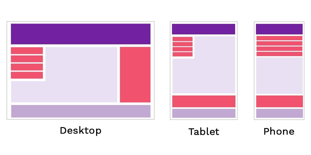
CSS3 introduced modules with new capabilities for responsive web designs. One of the main modules is the grid layout. It is a proportion-based layout concept.
Note: the proportion based means that the layout requires element size and shape to be related to other elements on the grid. It helps to avoid situations when an element is bigger than the screen, thus not fully visible.
- Easy to use with a learn-by-doing approach
- Offers quality content
- Gamified in-browser coding experience
- The price matches the quality
- Suitable for learners ranging from beginner to advanced
- Free certificates of completion
- Focused on data science skills
- Flexible learning timetable
- Simplistic design (no unnecessary information)
- High-quality courses (even the free ones)
- Variety of features
- Nanodegree programs
- Suitable for enterprises
- Paid Certificates of completion
- A wide range of learning programs
- University-level courses
- Easy to navigate
- Verified certificates
- Free learning track available
- University-level courses
- Suitable for enterprises
- Verified certificates of completion
Flexbox
The flexbox layout is another feature for creating mobile website designs. The flexbox improves the use of display property and lets you stack elements horizontally or vertically (depending on your designs). The elements can have a lot of space between one another or no space at all.
Media queries
The media queries and breakpoints play a huge role in the process of how to make a responsive website. You can set points when the size proportions and orientations change and make the layout adjust.
An important idea of this responsive web design tutorial is that setting device-based breakpoints is no longer a recommendation. It is better to use content-based breakpoints that respond to changes in the screen size and orientation.
CSS mobile: useful tips
- You need to know your audience when creating a website. If mobile users are going to be a part of your targeted audience, you should make sure that the website responds to viewport width and other factors.
- The mobile friendly website should not only respond to changes in the screen proportions and orientations. It should offer the same functions and not have unusable features.
