 HTML
HTML  CSS
CSS  PHP
PHP  JavaScript
  SQL
SQL  Bootstrap
  Solidity
  jQuery
  Git
Git  Chrome DevTools
  C++
C++  Python
 Contents
Creating border images in CSS
By using the CSS border-image property, you can use an image or a gradient as the border of an element:
#imgborder {
    -webkit-border-image: url(bdg-border.png) 20% round; /* Safari from 3.1 to 5 */
    -o-border-image: url(bdg-border.png) 20% round; /* Opera from 11 to 12.1 */
    border-image: url(bdg-border.png) 20% round; /* Chrome from 49 */
}CSS border-image is actually a shorthand for five subproperties:
border-image-sourceborder-image-sliceborder-image-widthborder-image-outsetborder-image-repeat
To use the shorthand, you need to list the values in the same order:
border-image: source slice width outset repeat;
The only value you need to define for the CSS border-image shorthand to work as intended is the source. If you omit any other value, it is simply set to its default value.
Each of the subproperties, along with the available values, will be explained in the following sections.
Border image source
The CSS border-image-source property specifies the path needed to access the image that you want to use as the border:
The syntax for border-image-source is simple:
border-image-source: value;
The default value for this property is none – this means no image is selected, so the element will be surrounded with a plain border. To select an image, define a source URL, CSS gradient, or an inline border SVG.
Slicing the image to make borders
The CSS border-image-slice property is used to specify how the image will be sliced to be used for the borders. The image must first be specified using border-image-source.
Images are sliced into nine parts: four sides, four corners, and the middle. The middle is normally invisible (transparent) and the corners and sides are used as the border image in CSS:
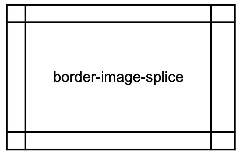
To define the slice, you need to specify the value in pixels for a raster image or coordinates for a SVG image. You can also use percentages to define a slice in relation of the image size:
Note: you can use the
fillkeyword to use the middle of the image as the element's background image.
- Easy to use with a learn-by-doing approach
- Offers quality content
- Gamified in-browser coding experience
- The price matches the quality
- Suitable for learners ranging from beginner to advanced
- Free certificates of completion
- Focused on data science skills
- Flexible learning timetable
- Simplistic design (no unnecessary information)
- High-quality courses (even the free ones)
- Variety of features
- Nanodegree programs
- Suitable for enterprises
- Paid Certificates of completion
- A wide range of learning programs
- University-level courses
- Easy to navigate
- Verified certificates
- Free learning track available
- University-level courses
- Suitable for enterprises
- Verified certificates of completion
Specifying the border image width
By using the border-image-width property, you can define a custom border image width in CSS:
#imgborder {
    border-image-source: url(bdg-border.png);
    border-image-width: 12px;
}The syntax for this property can take from one to four values that can be defined in percentages or unitless numbers:
border-image-width: value1 value2 value3 value4;
| Syntax | Example | Explanation |
|---|---|---|
| One value | border-image-width: 1; | All four sides are the same in width |
| Two values | border-image-width: 1 2; | The first value defines the width for the top and bottom borders. The second value defines the width for the left and right borders. |
| Three values | border-image-width: 1 2 3; | The first value defines the width for the top border. The second value defines the width for the left and right borders. The third value defines the width for the bottom border. |
| Four values | border-image-width: 1 2 3 4; | The first value defines the width for the top border. The second value defines the width for the right border. The third value defines the width for the bottom border. The fourth value defines the width for the left border. |
You can also use the keyword auto which will set the width to either the width of the border-image-slice or the border-width.
Note: the default value for the CSS
border-image-sliceproperty is1.
Setting the border image outset in CSS
The CSS border-image-outset property defines how much of the border sticks out of the outer edge of the element:
#imgborder {
    border-image-source: url(bdg-border.png);
    border-image-outset: 20px;
}
The syntax is rather intuitive:
border-image-outset: value;
Just like CSS border-image-slice, CSS border-image-outset can take up to four values:
| Syntax | Example | Explanation |
|---|---|---|
| One value | border-image-outset: 1; | The outset for all four sides is the same. |
| Two values | border-image-outset: 1 2; | The first value defines the outset for the top and bottom borders. The second value defines the outset for the left and right borders. |
| Three values | border-image-outset: 1 2 3; | The first value defines the outset for the top border. The second value defines the outset for the left and right borders. The third value defines the outset for the bottom border. |
| Four values | border-image-outset: 1 2 3 4; | The first value defines the outset for the top border. The second value defines the outset for the right border. The third value defines the outset for the bottom border. The fourth value defines the outset for the left border. |
Note: the default value for the CSS
border-image-outsetproperty is0, which means the border stays within the outer edges of the element.
Will the border image repeat?
Using the CSS border-image-repeat property, you can specify how the border image will be used to fill the border area:
#imgborder {
    border-image-source: url(bdg-border.png);
    border-image-repeat: round;
}You can specify either one or two values for this property:
border-image-repeat: value1 value2;
If you define one value, it will affect all borders equally. If you define two values, however, the first one will be used to modify the horizontal borders, and the second to modify the vertical borders.
In the table below, you can see all the available properties for CSS border-image-repeat:
| Value | Description |
|---|---|
stretch |
The default value. The image is stretched so it fills the whole area. |
repeat |
The image is repeated to fill the whole area. |
round |
The image is repeated to fill the whole area. If it does not fill the area with a whole number of tiles, the image is rescaled to make it fit. |
space |
The image is repeated to fill the whole area. If it does not fill the area with a whole number of tiles, the extra space is distributed around them. |
Browser support
Chrome
Edge
Firefox
IE
Opera
Safari
Mobile browser support
Chrome
Firefox
Opera
