 HTML
HTML  CSS
CSS  PHP
PHP  JavaScript
  SQL
SQL  Bootstrap
  Solidity
  jQuery
  Git
Git  Chrome DevTools
  C++
C++  Python
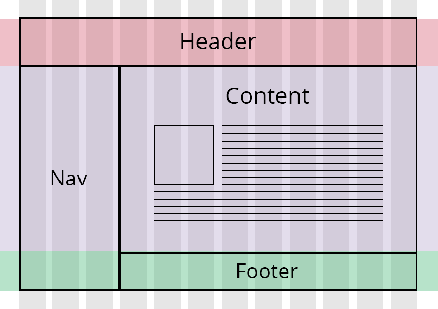
TL;DR — CSS grid layout is a technique for creating a responsive website by dividing its layout into columns and rows. Grid is the best option for solving layout problems that float or flexbox cannot solve. Additionally, you can divide pages into rows and paragraphs without changing the markup.
Contents
Creating a CSS grid system
The CSS grid system is based on splitting the layout into columns and rows. Using the grid layout module is the easiest way to design responsive websites. The grid layout usually consists of 12 columns but can have more.
The following example creates a simple CSS grid system. Here are the main steps:
- Set
display: grid. - Set sizes of rows and columns with
grid-template-columnsandgrid-template-columns.
.example {
  display: grid;
  grid-template-columns: 2fr 1fr 1fr;
  grid-template-rows: 100px 100px;
}
div {
border: solid 2px green;
padding: 5px;
margin: 3px;
}Tip: change the size of the window in the example to see that the CSS grid system responds and adjusts the sizes of columns and rows.
The next example creates a different responsive CSS grid:
.example {
  display: grid;
  grid-template-columns: 2fr 2fr 2fr;
  grid-template-rows: 100px 100px;
  grid-gap: 10px;
  background-color: #fff;
  color: #444;
}

div {
  background-color: purple;
  color: #fff;
  border-radius: 10px;
  padding: 25px;
  font-size: small;
}CSS grid vs flexbox
There are several major differences between CSS grid view system and flexbox:
- Grid layouts are two-dimensional systems. This idea means that the grid works with rows and columns. However, flexbox is one-dimensional and works either with columns or rows.
- Grid is great for creating big-scale layouts, while the flexbox is better for small-scale ones.
- Grid is layout-oriented, and flexbox is content-oriented. If you are unsure about the content of the website, you should choose grid (flexbox if you do).
- For defining columns or rows, you should work with flexbox. However, when you need to create a grid and fit content into two dimensions, the grid is the answer.
Note: you can combine the use of CSS grid system and flexbox for the best results.
CSS grid vs bootstrap
It is possible to use both CSS grid module and Bootstrap for creating the layout of your page. However, we recommend that you consider using the grid before turning to Bootstrap. Here are the reasons why:
- Grid code is easier to maintain as the HTML and CSS remain separate. Bootstrap wraps each row in
<div>and uses multiple classes. - Changing the layout in the grid is easy as you do not need to change the HTML code. Flexibility increases once you add media queries.
- Bootstrap offers a layout of 12 columns. Grid lets you create as many rows and columns as you like.
Note: the faster option is to use Bootstrap since the necessary code is provided to you. However, to manipulate the layout more, you should use the CSS grid module.
- Easy to use with a learn-by-doing approach
- Offers quality content
- Gamified in-browser coding experience
- The price matches the quality
- Suitable for learners ranging from beginner to advanced
- Free certificates of completion
- Focused on data science skills
- Flexible learning timetable
- Simplistic design (no unnecessary information)
- High-quality courses (even the free ones)
- Variety of features
- Nanodegree programs
- Suitable for enterprises
- Paid Certificates of completion
- A wide range of learning programs
- University-level courses
- Easy to navigate
- Verified certificates
- Free learning track available
- University-level courses
- Suitable for enterprises
- Verified certificates of completion
A list of properties for the grid
Here is a CSS grid cheat sheet of properties that control the way web page layout looks:
| Property | Description | Values |
|---|---|---|
| display | Sets an element as a grid container and creates a new grid formatting context | Grid and inline-grid to generate a block-level or inline grid |
| grid-template-columns | Sets the names of the lines and track sizing functions of columns | A percentage value or fraction (fr) of the available grid space |
| grid-template-rows | Sets the names of the lines and track sizing functions of rows | A percentage value, or fraction (fr) of the available grid space |
| grid-template-areas | Sets a grid template by referencing different grid area names | The name of the grid area. A period indicates an empty grid cell. None indicates that no grid areas are declared |
| grid-template | Sets grid-template-rows, grid-template-columns, and grid-template-areas in one declaration (shorthand) | Values of properties of the shorthand. None sets all properties to their default value |
| grid-column-gap | Sets the size of space between columns | Length indicators such as pixels |
| grid-row-gap | Sets the size of space between rows | Length indicators such as pixels |
| grid-gap | A shorthand for grid-column-gap and grid-column gap | Length indicators such as pixels |
| justify-items | Sets alignment along the inline (row) axis | start, end, center, stretch |
| align-items | Sets alignment along the block (column) axis | start, end, center, stretch |
| place-items | A shorthand for align-items and justify-items | start, end, center, stretch |
| justify-content | Sets alignment of the grid within the container (along the inline axis) | start, end, center, stretch, space-around, space-between, space-evenly |
| align-content | Sets alignment of the grid within the container (along the block axis) | start, end, center, stretch, space-around, space-between, space-evenly |
| place-content | A shorthand for setting align-content and justify-content | start, end, center, stretch, space-around, space-between, space-evenly |
| place-content | A shorthand for setting align-content and justify-content | start, end, center, stretch, space-around, space-between, space-evenly |
| grid-auto-columns | Sets the size of column track or pattern of tracks | length indicators, percentages, flex, max-content, min-content, minmax, first-content(argument), auto |
| grid-auto-rows | Sets the size of row track or pattern of tracks | length indicators, percentages, flex, max-content, min-content, minmax, first-content(argument), auto |
| grid-auto-flow | Sets the auto-placement algorithm | row, column, dense |
| grid | A shorthand for grid-template-rows, grid-template-columns, grid-template-areas, grid-auto-rows, grid-auto-columns, and grid-auto-flow | None sets all properties to their default values. Accepts values of each property of the shorthand |
| grid-column | A shorthand grid-column-start and grid-column-end. Sets the size of grid items and their location within the grid column | Number of the start and end line |
| grid-row | A shorthand grid-row-start and grid-row-end. Sets the size of grid items and their location within the grid row | Number of the start and end line |
| grid-area | A shorthand for grid-row-start, grid-column-start, grid-row-end, and grid-column-end. Names the items in the grid | Name and values of the properties in the shorthand |
| justify-self | Sets alignment inside a cell along the inline axis | start, end, center, stretch |
| align-self | Sets alignment inside a cell along the block axis | start, end, center, stretch |
| place-self | A shorthand for align-self and justify-self | Auto sets the default alignment. Accepts values of the properties of the shorthand |
Building a layout without grid
In order to create a layout, you have to set the box-sizing property to border-box for all HTML elements. It confirms that borders and padding are included in the total dimensions of these elements.
The next example shows a simple responsive website that consists of two columns:
.firstC {
 width: 60%;
 float: left;
 border: solid #a4508b 5px;
 padding: 10px;
}

.secondC {
 width: 40%;
 float: left;
 border: solid #2f004f 5px;
 padding: 10px;
}
The following example creates a responsive layout that has five columns.
Firstly, you have to specify the width of every column. We go for 25% / 25% / 25% / 25% / 100%.
Then, you create a CSS class for every column.
.C-1 {width: 25%;}
.C-2 {width: 25%;}
.C-3 {width: 25%;}
.C-4 {width: 25%;}
.C-5 {width: 100%;}
In the next example, we make all the columns (C-) float to the left, and add 5px padding:
[class*="C-"] {
 float: left;
 border: solid #a4508b 5px;
 padding: 5px;
}
You also need to create a separate <div> for each row. Every row must have all 5 columns summed up:
<div class="row">
  <div class="C-1">...</div>
  <div class="C-2">...</div>
  <div class="C-3">...</div>
  <div class="C-4">...</div>
  <div class="C-5">...</div>
</div>
The columns in a row float to the left and are not affected by the normal flow of the page. However, other elements would be misplaced because of the flow. Therefore, we have to create a style to clear it:
Finally, we add some styles and colors to make the website look more inviting:
html {
 font-family: "Arial", sans-serif;
}

.back-up {
 background-color: #ced4da;
}

.back-up :hover {
 background-color: #a4508b;
}

.back-down {
 background-color: #858585;
}
CSS grid responsive: useful tips
- The CSS grid is not a framework. It is a built-in feature of CSS and is supported by all modern browsers.
- A CSS grid track refers to space between any two lines on the grid.
- The
repeat()function helps to handle grids with many tracks by repeating all or a section of the track listing.
