Key Takeaways
- Using the best crypto indicators helps traders assess trends, momentum, volatility, and market sentiment for more informed decisions;
- Layering technical indicators with sentiment tools like BitDegree’s Fear and Greed Index supports disciplined trading in volatile markets;
- Avoid indicator overload to prevent conflicting signals and maintain a focused, actionable approach.
Deposit $500 and Get $50. Earn up to 8.5% Yield with Democratized Prime. Unlock Liquidity with Crypto-Backed Loans at 8.91% interest. Choose your offer today!
Traders rely on best crypto indicators to read the subtle hints the market leaves behind. Discretionary traders combine them with chart patterns to confirm what the price suggests, while systematic traders integrate signals into automated strategies for precise entry and exit points.
Trend, momentum, and volatility indicators each tell part of the market story, building a fuller picture of crypto action. Exchanges like Binance and Bybit put these indicators at traders’ fingertips, making it easier to interpret the signals behind every candle.
By analyzing volume changes, support and resistance levels, and stacking tools, opportunities can be revealed that raw price movements alone can’t. With that in perspective, let’s explore the most effective indicators and techniques that give traders a clearer sense of where the market might head next!

Did you know?
Subscribe - We publish new crypto explainer videos every week!
What is a Crypto Bridge? (Explained with Animations)


Table of Contents
- 1. Best Crypto Indicators to Consider
- 1.1. Simple Moving Average (SMA)
- 1.2. Relative Strength Index (RSI)
- 1.3. Exponential Moving Average (EMA)
- 1.4. Moving Average Convergence Divergence (MACD)
- 1.5. Stochastic Oscillator
- 1.6. Bollinger Bands
- 1.7. Average True Range (ATR)
- 1.8. Ichimoku Cloud
- 2. Strategic Application of Top Crypto Indicators
- 3. Additional Tools for Market Sentiment
- 3.1. Crypto Fear and Greed Index
- 3.2. Bitcoin Dominance
- 3.3. Bitcoin Rainbow Chart
- 4. Conclusions
Best Crypto Indicators to Consider
To navigate crypto markets effectively, using the best crypto indicators can make a big difference. The following eight tools highlight key ways to assess trends, momentum, volatility, and sentiment, helping traders make more informed decisions.
Latest Changelly Coupon Found:Simple Moving Average (SMA)
The Simple Moving Average calculates the arithmetic average of an asset’s price over a specified number of periods, typically using closing prices.
Category | Trend |
What It Measures | Average price over a set period |
Typical Use | ✓ Identifying trends ✓ Determining support/resistance levels ✓ Spotting key crossover signals |
Table: An overview of the SMA indicator
By smoothing out price fluctuations on a candlestick chart, the SMA highlights the underlying trend and helps traders focus on the bigger picture rather than short-term noise.
Short-term SMAs, such as the 20-day or 50-day, react quickly to recent price movements. Meanwhile, long-term averages, like the 200-day SMA, respond more slowly and reveal broader market trends.
An important aspect of the SMA is that the indicator is based entirely on historical data,[1] so it trails behind the current price rather than predicting future market movements.
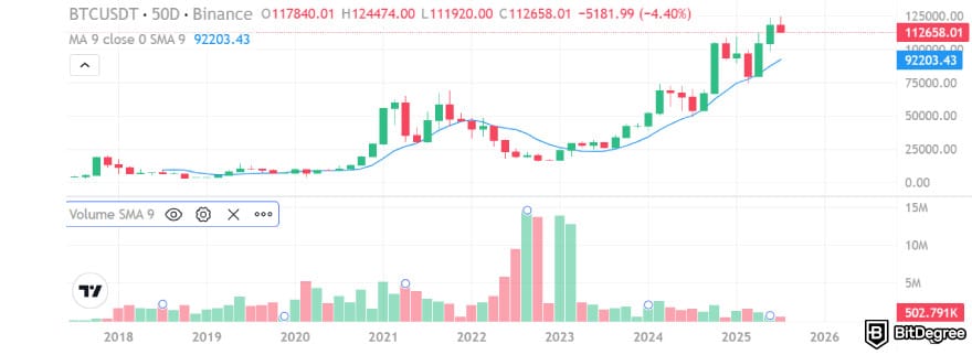
In an uptrend, the SMA line usually appears below the price line, while in a downtrend, it appears above. When the market changes direction, the SMA continues to reflect the previous trend until it catches up, and the point where the SMA crosses the price often serves as a key signal for traders.
Traders often use SMAs to identify support and resistance levels and to confirm trends. A price staying above the SMA generally signals an uptrend, while a price below indicates a downtrend. Comparing SMAs of different timeframes can reveal additional market insights, such as potential trend reversals.
For instance, if a 50-day SMA rises above the 200-day SMA, it forms a Golden Cross, often interpreted as a bullish signal that may indicate further gains. Conversely, when the 50-day SMA drops below the 200-day SMA, it creates a Death Cross, signaling potential bearish momentum.
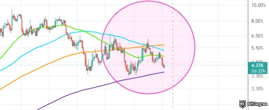
SMA is also a common tool to measure market direction across assets such as Bitcoin and Ethereum. Holding above the 50-day SMA often reflects sustained buying strength, while staying below highlights ongoing weakness.
Paired with EMA or MACD, the SMA sharpens entry and exit timing. Using these indicators together strengthens signal validation and brings more clarity to trend analysis.
📚 Read More: The Next Crypto Bull Run Explained
Relative Strength Index (RSI)
The Relative Strength Index measures the speed and magnitude of recent price changes to determine momentum in the market.
Category | Momentum |
What It Measures | Speed and magnitude of price movements |
Typical Use | ✓ Identify overbought/oversold conditions ✓ Finding trend reversal patterns ✓ Searching entry/exit points |
Table: An overview of the RSI indicator
Developed by Welles Wilder in 1978, RSI compares upward movements in an asset’s closing price to its downward movements over a specified period, typically 14 days. By calculating this ratio, the indicator oscillates between 0 and 100, providing traders with a clear view of when a market may be overextended.
Readings above 70 suggest that an asset may be overbought, signaling that a price correction or reversal could be approaching. Conversely, readings below 30 indicate oversold conditions, which may point to an upcoming upward move.

Divergences between RSI and price movements serve as another powerful signal. For example, if Bitcoin makes a new high but RSI fails to reach a corresponding high, it could indicate weakening momentum and a potential reversal.
Traders often use RSI to validate trends and detect short-term trading opportunities. Combining RSI with other indicators, such as moving averages, enhances its reliability by confirming signals and reducing false positives.
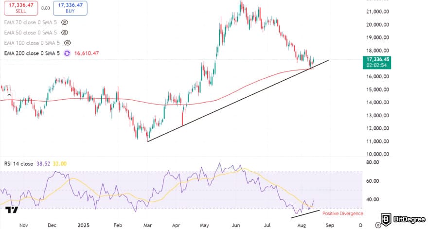
The said indicator is particularly effective in oscillating markets where the price alternates between bullish and bearish swings. Still, it also provides value during trending markets by highlighting the strength of ongoing moves.
During strong trends, RSI can remain overbought or oversold for long periods, showing sustained momentum. Therefore, traders should weigh the broader trend before reacting.
Exponential Moving Average (EMA)
The Exponential Moving Average prioritizes recent prices, so it’s more responsive to current market movements than a Simple Moving Average. Each new price contributes more to the EMA calculation, while older prices gradually lose influence over time.
Category | Trend |
What It Measures | Weighted average emphasizing recent prices |
Typical Use | ✓ Identifying short-term trends ✓ Determining support/resistance levels ✓ Finding crossover signals |
Table: An overview of the EMA indicator
The weighting decreases exponentially, meaning older data never disappears completely but becomes almost negligible. This responsiveness makes the EMA valuable for tracking rapid price fluctuations, especially in volatile crypto markets like Bitcoin and Ethereum.
Standard settings often use the 12-day and 26-day EMAs for short-term trends, while the 50-day and 200-day EMAs track longer-term movements.
In crypto’s volatile markets, traders also apply EMAs to 5-minute, 15-minute, or 1-hour charts to spot intraday shifts. Because EMAs react faster than SMAs, they provide timely signals and rank among the best crypto indicators for day trading.

Beyond spotting trends, EMAs also help traders map out support and resistance zones. A short-term EMA crossing above a long-term EMA can signal a potential buying setup, while a cross below often points to a possible sell signal.
Pairing EMA with SMA strengthens trend confirmation and clarifies market strength. EMA’s responsiveness is particularly useful in crypto markets during high-volatility periods.
Moving Average Convergence Divergence (MACD)
The MACD is a trend-following momentum indicator that shows the relationship between two exponential moving averages of an asset’s price.
Category | Trend & Momentum |
What It Measures | Relationship between two EMAs and their momentum |
Typical Use | ✓ Identifying trend direction ✓ Confirming trend strength ✓ Spotting buy/sell signals |
Table: An overview of the MACD indicator
Typically, the 12-period EMA and the 26-period EMA are used. The MACD line is calculated using the formula below:
MACD = 12-period EMA − 26-period EMA
A nine-day EMA of the MACD line forms the signal line, which traders use to identify potential buy or sell signals. The histogram represents the difference between the MACD line and the signal line, visually showing the strength and direction of momentum.
Traders watch for crossovers to generate signals. When the MACD line crosses above the signal line, it indicates bullish momentum and a potential buy opportunity. On the contrary, a MACD line crossing below the signal line signals bearish momentum and a possible sell.

Divergences between the MACD and the asset’s price reveal further insight. If the price makes a lower low while the indicator forms a higher low, it points to a bullish divergence that highlights strengthening momentum.
Some traders watch for bullish divergences even in negative long-term trends, as they can hint at a potential reversal. However, these signals are riskier and less reliable than those aligned with the prevailing trend.

Did you know?
Subscribe - We publish new crypto explainer videos every week!
What are Stablecoins, Altcoins & Wrapped Coins Explained!


Stochastic Oscillator
The Stochastic Oscillator is a momentum indicator that measures where an asset’s closing price sits relative to its price range over a specific period.
Category | Momentum |
What It Measures | Momentum relative to the price range over a period |
Typical Use | ✓ Identifying overbought/oversold conditions ✓ Finding trend reversal patterns ✓ Searching potential entry/exit points |
Table: An overview of the Stochastic Oscillator indicator
Typical settings use a 14-day period, though traders may adjust it to capture shorter or longer trends. The oscillator produces values between 0 and 100, with readings above 80 signaling overbought conditions and readings below 20 indicating oversold conditions.
Crossovers between the %K line (the fast oscillator) and the%D line (a three-period moving average of %K) generate potential buy and sell signals.

When %K crosses above %D in the oversold zone, it signals a potential buying opportunity. When %K crosses below %D in the overbought zone, it can signal a potential sell opportunity.
Traders often include the Stochastic Oscillator among the best crypto trading indicators to anticipate trend reversals in range-bound or sideways markets. On top of that, divergence between the oscillator and the price action also provides important clues.
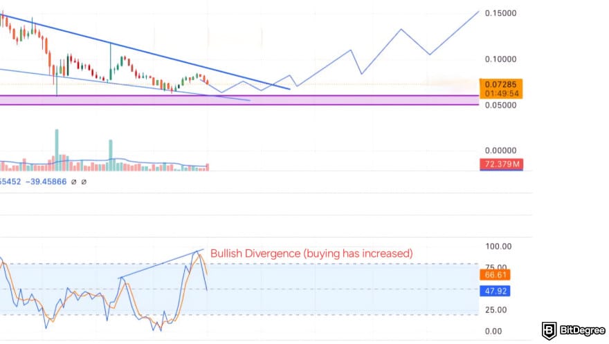
Let’s say a bearish trend reaches a new low while the oscillator prints a higher low. It may indicate that downward momentum is weakening, hinting at a bullish reversal. Similarly, a new high in price not confirmed by the oscillator can suggest exhaustion in upward momentum.
However, traders should observe changes in the oscillator rather than relying solely on absolute levels. For instance, if Bitcoin trades near the upper end of its recent range but %K starts to dip below %D, traders may prepare for a short-term correction or consolidation.
📚 Read More: Bitcoin Price Prediction
Bollinger Bands
Bollinger Bands track price volatility by using a moving average at the center with upper and lower bands plotted two standard deviations away. The width of the bands reflects volatility, with wider gaps showing increased activity and tighter gaps showing reduced momentum.
Category | Volatility |
What It Measures | Price volatility and potential overbought/oversold conditions |
Typical Use | ✓ Timing entries/exits ✓ Confirming trend direction ✓ Anticipating breakouts |
Table: An overview of the Bollinger Bands indicator
You’ll often hear about a "squeeze" in Bollinger Bands, which happens when the bands tighten and hint that volatility is about to return. Since the bands don’t show direction, it’s best to pair them with other tools like MACD or EMAs to confirm the trend.
If the price pushes against the upper band, you can take it as a sign of overbought conditions, while moves near the lower band often suggest oversold territory. At the same time, the slope of the middle SMA gives extra context, with a rising line favoring strength and a falling line showing weakness.

Breakouts reveal even more information. A price move above the upper band on substantial volume can show a rally is accelerating, whereas a sharp dip below the lower band might be an early warning of further downside. For many traders, Bollinger Bands act as a roadmap to prepare stop-loss levels and anticipate big swings.
📚 Read More: Will Crypto Recover? Insights on Market Volatility
Average True Range (ATR)
The Average True Range (ATR) quantifies market volatility by analyzing price ranges over a selected period, usually 14 days.
Category | Volatility |
What It Measures | Market volatility and range of price movements |
Typical Use | ✓ Setting stop-loss and take-profit levels ✓ Adjusting trade size ✓ Confirming trend strength |
Table: An overview of the ATR indicator
Instead of only checking the highs and lows of the day, ATR uses three ranges:
- The difference between the current high and the current low.
- The difference between the current high and the previous close.
- The difference between the current low and the previous close.
The largest of these values is selected, then averaged over a set period, most often fourteen days. This approach gives traders a clearer sense of how much an asset usually moves.
ATR is subjective, with interpretations shifting by market conditions. Comparing current and past values helps gauge trend strength and guide trading strategies.
The choice of period makes a difference. A shorter one reacts faster to sudden swings, while a longer one smooths things out and reduces the noise. ATR does not predict direction, but it does reveal how active or quiet the market is. A high ATR indicates intense price swings, whereas a low ATR often suggests calm, sideways trading.
Rising volatility as prices reverse can signal that the move has conviction. On the other hand, a shrinking ATR during consolidation often shows that the market is resting before the next breakout. Traders keep an eye on these shifts because they frequently line up with key turning points.

ATR also plays a big role in everyday trade management. Many traders rely on it when setting take-profit and stop-loss levels. Wide stops make sense during high volatility, as they reduce the risk of being stopped out too early.
Narrow stops work better in calmer markets where price movements are smaller. Some traders even use multiples of the ATR to account for sharp moves. It is also a practical tool for position sizing, ensuring that trades match both market conditions and a trader’s risk tolerance.
Ichimoku Cloud
The Ichimoku Cloud, also called Ichimoku Kinko Hyo, was developed by Japanese writer Goichi Hosoda in the late 1930s. It is a comprehensive technical indicator designed to provide a clear view of price action and momentum at a glance.
The term Ichimoku roughly translates to "one look", reflecting its purpose of allowing traders to assess a chart’s trend, momentum, and potential support or resistance levels with a single glance.[2]
Category | Trend |
What It Measures | Trend direction, support/resistance, momentum |
Typical Use | ✓ Identifying trend strength ✓ Finding potential reversals ✓ Spotting entry/exit points ✓ Determining support/resistance levels |
Table: An overview of the Ichimoku Cloud indicator
The indicator is built on five lines, each adding a layer of perspective:
- Conversion Line: Short-term average of highs and lows, typically over 9 periods.
- Base Line: Longer-term average, usually over 26 periods.
- Leading Span A: Midpoint between the Conversion and Base Line, plotted 26 periods ahead.
- Leading Span B: 52-period average, also shifted forward 26 periods.
- Lagging Span: Current closing price plotted 26 periods back.
The space between Leading Span A and B forms the “cloud”, or Kumo. Think of it as a shaded zone that constantly shifts and acts like dynamic support or resistance. When price sits above the cloud, momentum leans bullish. When it falls below, the trend turns bearish.

And whenever prices hover inside the cloud, the market is basically in a waiting game, building pressure until a breakout reveals the next direction. Even the thickness of the cloud adds meaning, since a wider section hints at stronger momentum.
Signals also come from line crossovers. When the Conversion Line rises above the Base Line, it often suggests short-term upward movement, especially when this action plays out above the cloud.
A downward crossover flips that logic. The Lagging Span then steps in as a final check, confirming whether the price is actually moving in line with the bigger trend.
Because of its forward-looking nature, traders often prefer to use the Ichimoku Cloud on daily or weekly charts. It tends to shine when markets are trending, giving a clear picture of potential reversals and key zones of support and resistance.
📚 Read More: How to Make Money in a Crypto Bear Market
Strategic Application of Top Crypto Indicators
To get the most out of the best indicators for crypto trading, using them strategically and in combination is key. Each tool gives you a different angle on the market, and pulling those insights together helps confirm what you see and avoids unnecessary guessing.
Here are practical ways to use crypto indicators effectively:
- Backtest Strategies. Platforms like TradingView let you simulate trades using historical data to see how indicator combinations perform over time.
- Combine Multiple Indicators. Pair trend indicators like MACD with momentum tools such as RSI and volatility-based indicators like ATR to capture multiple facets of market behavior.
- Avoid Indicator Overload. Applying too many tools at once can produce conflicting signals, making decisions harder instead of easier.
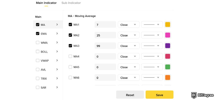
- Incorporate Risk Management. ATR can guide stop-loss placement based on market volatility, helping protect against sharp swings.
- Confirm Signals. Cross-check indicator signals before entering or exiting trades to reduce false alarms.
By following these steps, traders can harness the best indicators for crypto trading while keeping their strategies disciplined and focused.
Major exchanges like Kraken and Coinbase offer access to many of these technical indicators through TradingView integration, adding both convenience and depth to analysis. With careful risk management and well-structured insights, you’ll be able to navigate volatility and respond to market shifts with more clarity.
Additional Tools for Market Sentiment
In crypto markets, where emotions often drive price swings, relying solely on technical indicators can leave gaps in understanding market behavior. Sentiment tools provide insights into trader psychology, revealing fear, greed, and overall market confidence.
Incorporating these alongside the best crypto indicators helps traders gauge whether trends are backed by collective sentiment or fueled by temporary hype, creating a more complete view of potential market moves.
📚 Read More: How to Swing Trade Crypto
Crypto Fear and Greed Index
The Crypto Fear and Greed Index is a handy tool that measures the mood of the crypto market with a daily score from 0 to 100. Lower scores indicate extreme fear, where panic and caution prevail, and some traders may perceive a buying opportunity.
Market Sentiment | Interpretation | |
|---|---|---|
0–20 | Extreme Fear | Market panic, pessimism, widespread selling |
21–40 | Fear | Caution, risk aversion, moderate selling |
41-60 | Neutral | Market in balance, hesitation, cautious trading, no strong conviction |
61–80 | Greed | Optimism, strong buying, bullish sentiment |
81–100 | Extreme Greed | FOMO, buying spree, overconfidence |
Table: Crypto Fear and Greed Index levels
As shown in the table above, higher scores show extreme greed. At these levels, excitement and euphoria can drive prices up, but also signal potential corrections. Essentially, the index provides a quick snapshot of the market's sentiment on any given day.
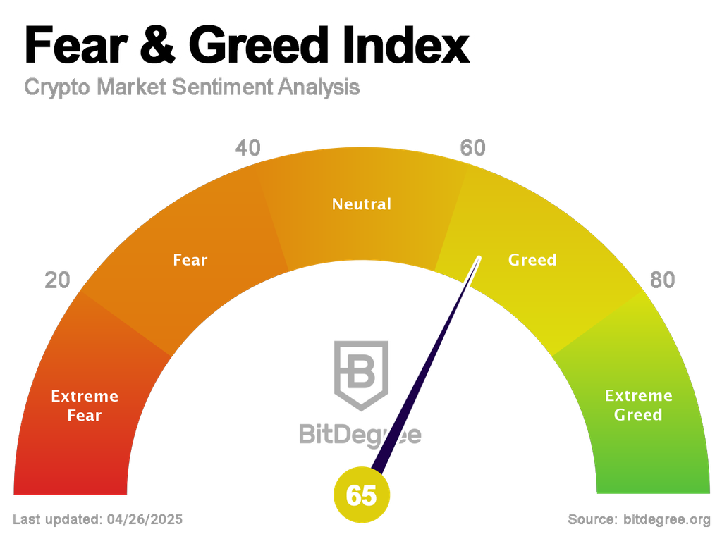
Several factors are measured by the index to determine the score:
- Volatility, Trading Volume, and Momentum. Show how strongly the market is moving and whether traders are reacting quickly.
- Coin Dominance. Big players like Bitcoin and Ethereum get attention during fearful times, while smaller coins often see more action when greed takes over.
- Social Media and Online Trends. Chatter, news, and Google searches reveal how people are feeling, giving another layer of insight into market sentiment.
Traders often use the index alongside their usual charts and indicators to confirm signals or avoid chasing hype. For instance, extreme fear paired with an oversold reading could be a solid entry point, while extreme greed might mean it’s time to pull back.
Tracking BitDegree’s Crypto Fear and Greed Index daily can give you a quick read on the market’s mood, helping you make smarter moves instead of reacting to every swing.
Bitcoin Dominance
Bitcoin dominance tracks how much of the total cryptocurrency market is represented by Bitcoin’s market cap. Essentially, it shows how strong Bitcoin is compared to the rest of the market. Calculating it is simple:
Divide Bitcoin’s market cap by the total market cap of all cryptocurrencies and multiply by 100.
For example, if the entire crypto market is valued at $2 trillion and Bitcoin’s market cap is $1 trillion, BTC dominance would be 50%. Many charting platforms, like TradingView, display BTC.D directly as a percentage, so traders do not need to calculate it manually.
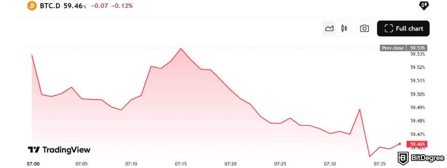
Tracking Bitcoin dominance provides insight into market sentiment. A rising BTC dominance usually signals risk-off conditions, where investors prefer the perceived safety of Bitcoin over altcoins. Falling dominance points to a risk-on environment, with capital moving into altcoins, especially Ethereum.
Traders often combine BTC dominance with technical indicators, such as an EMA trend or a bullish MACD crossover on an altcoin, to time entry points in the altcoin market. Monitoring daily shifts in BTC.D can give a sense of where the market’s attention and risk appetite are heading.
📚 Read More: How to Make Money With Bitcoin

- Secure and reliable
- Accepts fiat currencies
- Lots of trading options
- Reputable exchange
- Accepts fiat currencies
- Offers various trading options

- Huge trading variety
- Regulation-compliant around the globe
- Fair trading fees
- Beginner-friendly
- A wide array of features
- Vast number of different crypto coins & tokens

- Beginner-friendly
- Secure
- Decent trading and withdrawal fees
- Crypto.com Visa Card
- Automated tools & bots
- Ecosystem synergy with CRO
Bitcoin Rainbow Chart
The Bitcoin Rainbow Chart uses historical price data to create color-coded bands that suggest potential valuation zones over the long term.
Each band represents a general market condition, helping traders identify periods to buy, accumulate, hold, or sell Bitcoin. Traders often check the chart on Blockchaincenter.net while confirming signals with trend indicators like SMAs or MACD.
The Rainbow Chart is somewhat controversial in the crypto industry. Critics point out that it was created specifically for Bitcoin and lacks historical validation in traditional financial markets.
The bands and their general guidance can be summarized as follows:
Color | Market Condition | Suggested Action | |
|---|---|---|---|
Bitcoin is dead | Purple | Extremely undervalued, typically during severe bear markets or major price crashes | Strong buy opportunity |
Basically a Fire Sale | Blue | Significantly undervalued, often after sharp corrections | Buy aggressively |
BUY! | Light Blue | Favorable low-price zone with growing confidence | Consider buying especially for long-term accumulation |
Accumulate | Green | Still undervalued, but less than the previous bands | Accumulate positions for potential long-term gains |
Still cheap | Dark Green | Prices are gaining traction during recovery phases | Buy or hold depending on strategy |
HODL! | Yellow | Optimism returns, prices trending upward | Hold existing positions |
Is this a bubble? | Light Orange | Market nearing speculative territory | Hold or prepare for a potential exit |
FOMO Intensifies | Orange | Speculative behavior dominates, FOMO | Take partial profits or reduce exposure |
Sell, Seriously, SELL! | Red | Extreme euphoria, bubble territory | Sell BTC, corrections likely |
Maximum Bubble Territory | Dark Red | Highest speculative mania | Sell remaining positions if not already sold |
Table: Bitcoin Rainbow Chart bands and recommended actions
Do note that the chart tends to be overly optimistic, often projecting long-term upward trends even during potential downward movements. Some argue that this bias can give traders a false sense of security.
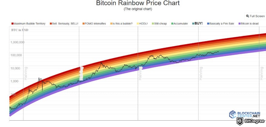
Despite these criticisms, the Rainbow Chart remains widely referenced in online communities. Its visual layout provides a simplified view of Bitcoin’s price relative to historical extremes, helping traders think about relative valuations over years rather than daily fluctuations.
All in all, combining the chart with other technical indicators and fundamental research can improve its usefulness while avoiding reliance on the chart alone.
Conclusions
Tracking the best crypto indicators can give traders a clearer picture of market trends, momentum, and sentiment. From EMA and Bollinger Bands to the Crypto Fear and Greed Index, mixing technical tools with sentiment indicators and crypto fundamental analysis creates a more complete approach.
Using these indicators together helps identify potential entry and exit points while keeping a pulse on the broader market mood. Applying them consistently and patiently improves your chances of spotting meaningful signals. Remember, there is no single tool that guarantees success, but aligning insights strengthens your strategy and confidence.
The content published on this website is not aimed to give any kind of financial, investment, trading, or any other form of advice. BitDegree.org does not endorse or suggest you to buy, sell or hold any kind of cryptocurrency. Before making financial investment decisions, do consult your financial advisor.
Scientific References
1. Kallio J.: ‘Comparing the Performance of Common Technical Analysis Indicators Used in Cryptocurrency Trading’;
2. Alarbi A., Khalifa W., Alzubi A.: ‘A Hybrid AI Framework for Enhanced Stock Movement Prediction: Integrating ARIMA, RNN, and LightGBM Models’.
