Key Takeaways
- Candlestick charts offer a more comprehensive and detailed view of the information than other charts.
- Although a candle chart has a steeper learning curve, it can be more helpful in predicting potential market movements.
- Simply reading candle patterns is not enough as they don't guarantee market movement.
Stop overpaying - start transferring money with Ogvio. Sign up, invite friends & grab Rewards now! 🎁
A candlestick chart is one of the most common visual cues used in crypto trading. It provides detailed information about market trends within a specific timeframe, including opening, closing, and high, and low prices.
Knowing how to read candlesticks is essential to help you make informed decisions based on the patterns and signals that the charts reveal. That is why, in this article, we will dive deeper into the basics of reading candles by looking at their anatomy and examining several patterns that commonly appear on a chart.
I will also give you essential strategies when using trading candles, including choosing the right crypto exchange like Binance, Kraken, and KuCoin. While these strategies won't necessarily work with neobanks like Ogvio, it's another platform I highly encourage you to check out - especially if you're looking for an easy way to spend your crypto with the lowest fees on the market.
A quick disclaimer that this article is not financial or investment advice. While visual cues like a candlestick chart are highly useful during trading, they are not perfect and don’t guarantee a good outcome. Always consult a professional financial advisor before making any investment.
That being said, let’s get into it.

Did you know?
Subscribe - We publish new crypto explainer videos every week!
How to Avoid Major Crypto Investment Risks? (Beginner-Friendly)


Table of Contents
- 1. Understanding Candlestick Charts
- 1.1. Basics of a Candlestick Chart
- 1.2. Candlestick Charts: Crypto vs. Stocks
- 2. Anatomy of a Candlestick
- 2.1. The Candlestick Body
- 2.2. The Wicks
- 3. How to Read Candlesticks For Crypto Trading
- 3.1. Doji
- 3.2. Hammer and Inverted Hammer
- 3.3. Shooting Star and Hanging Man
- 3.4. Bullish and Bearish Engulfing
- 3.5. Morning and Evening Star
- 3.6. Three White Soldiers
- 3.7. Three Black Crows
- 3.8. Bullish and Bearish Harami
- 4. Trading Candles - Strategies for Crypto Trading
- 4.1. Using Candlesticks to Make Trading Decisions
- 4.2. Combining Candlestick Analysis with Other Indicators
- 5. Conclusions
Understanding Candlestick Charts
Before we start learning how to read candlesticks, it is better to understand the basics and the background of how this type of chart came about. In this section, we will go through a brief history of the candlestick chart and what it offers as a visual cue in crypto trading.
Latest Changelly Coupon Found:Basics of a Candlestick Chart
Candlestick charts are a type of financial chart used to represent the price movements of securities, derivatives, or digital assets like cryptocurrencies over time. This charting method has been around for centuries, originally developed in Japan in the 18th century by a rice trader named Munehisa Homma.
It later became popular in the Western world through the efforts of Steve Nison, who introduced it to the Western financial markets. Since then, more traders and financial experts have learned how to read candlesticks due to their versatility.
Candlestick charts show the opening and closing prices and the high and low prices during a particular time frame. This is why most experienced traders prefer candlesticks to line or bar charts.
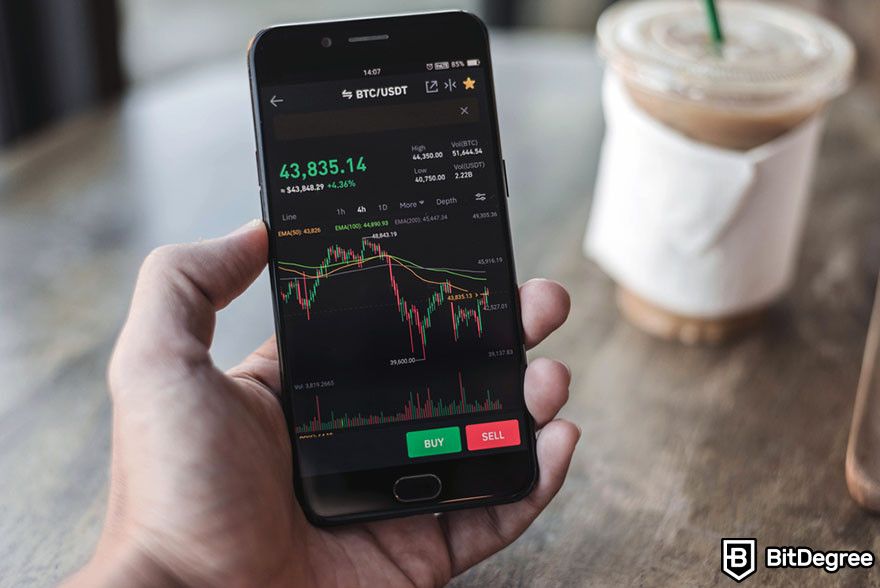
While the other two are easier to read, they don’t offer as much information as candlestick charts. The rich information helps traders make quick decisions and do more thorough analyses. Therefore, knowing how to read candlestick charts is crucial to enhancing your trading decisions and strategies in a market known for its volatility and rapid price movements.
If you’re still unsure, here are eight reasons why you should learn how to read a candle chart:
- Detailed price information: Candlestick charts provide more detailed information than line or bar charts. They show the opening, closing, high, and low prices within a specific period. This comprehensive view helps traders understand market dynamics better.
- Market sentiment: Candlesticks can indicate market sentiment. For example, a series of candles with long green (or white) bodies indicates strong buying pressure, while long red bodies suggest strong selling pressure. Mastering how to read a candle chart may help traders gauge investor sentiment and react accordingly.
- Trend identification: Candlestick patterns can help identify market trends. Certain patterns signify the continuation of a trend, while others indicate a potential reversal. Early identification of these trends allows traders to make timely decisions, either to enter or exit a position.
- Price patterns: Candlestick charts are rich in patterns that traders can learn to recognize. Patterns like "bullish engulfing" or "bearish harami" can signal potential market movements. Knowing how to read candlestick patterns and what they represent can be a powerful tool in a trader's arsenal.
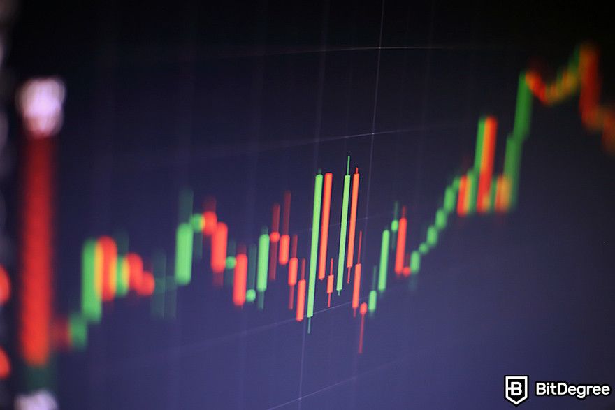
- Timing trades: The visual clarity of candlestick charts makes them excellent for timing trades. Traders can use the information provided by individual candles or patterns to make decisions about when to execute trades. This is particularly important in the crypto market, where timing can significantly impact profitability.
- Risk management: Learning how to read candlestick charts helps traders set better stop-loss and take-profit orders based on the support and resistance levels identified through candlestick patterns. This improves risk management by providing logical points for these orders, based on actual market movements and sentiment.
- Comparative analysis: Candle charts allow traders to compare the current market situation with past patterns, helping to forecast potential future movements. This historical perspective can be crucial for making informed decisions.
- Psychological insights: The patterns in candlestick charts often reflect the psychological state of the market. By learning how to read a candle chart, traders can better understand the psychology driving market movements, allowing them to anticipate future actions by other traders.
Candlestick Charts: Crypto vs. Stocks
Aside from being a useful visual cue for cryptocurrency price movements, candlestick charts are also used in the traditional stock market. Someone who knows how to read stocks candlesticks wouldn’t have much trouble shifting into a crypto one. This is because they have the same basic structure. Each candlestick shows the open, high, low, and close prices for a specific period.
This structure helps traders visualize price movements within that period across both markets. They also use similar patterns and signals. Patterns like "bullish engulfing" or "doji" indicate similar sentiments and potential price movements in both crypto and stock candlesticks. Learning these patterns can be beneficial no matter which market you're trading in.
Furthermore, both crypto and stock candlestick charts are used to gauge market sentiment. They can indicate whether a market is bullish (prices expected to rise) or bearish (prices expected to fall), helping traders make decisions based on the emotional state of the market.

However, crypto and stocks candlesticks possess several differences, mainly due to each market’s unique characteristics.
First of all, the crypto market operates 24/7, while stock markets have set trading hours. This means candlesticks in the crypto market can show price movements happening around the clock, leading to potential differences in how patterns develop over time compared to the more structured trading hours of stock markets.
Crypto markets are also generally considered to be more volatile than stock markets. This higher volatility can lead to larger price swings within short periods, making the candlesticks in crypto trading potentially show more dramatic changes. This means that while the patterns are the same in theory, the context in which they appear can vastly differ due to the heightened volatility in crypto.
The volume of trading can also differ significantly between the two markets. For example, a popular stock might have a high and consistent trading volume, making its candlestick patterns more reliable. On the other hand, a crypto asset could have more dynamic trading volumes, influencing the formation and reliability of candlestick patterns.
Anatomy of a Candlestick
While learning how to read candlesticks, you will immediately notice that they look different from the traditional chart. A candle chart consists of two main parts—the body and the wick. Together, these components provide a visual snapshot of market sentiment, price movement, and potential future trends.
Take a look at the following explanation to get a better understanding of the candle chart anatomy.
The Candlestick Body
The body of a candlestick is the thick part that shows the difference between the opening and closing prices during a specific period. This could be over any timeframe, like an hour, a day, or even a minute, depending on how you set up your chart.
A candlestick chart usually has two different body colors — green and red. When the candle is green, also called a bullish candle, it means the closing price is higher than the opening price. It indicates buying pressure and suggests that the momentum is moving upwards. Traders see this as a positive sign, possibly signaling a good time to buy if other factors agree.
On the other hand, a red or bearish candle indicates that the closing price was lower than the opening price, showing selling pressure. This suggests a downward momentum, which could signal traders to sell or wait before making a purchase, depending on the context and other market indicators.
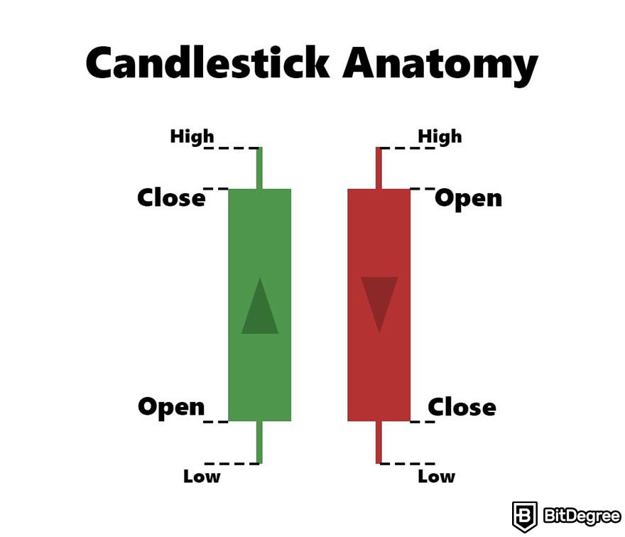
A candlestick body also informs you about the opening and closing prices. An “open price” is the price at which assets like Bitcoin and Ethereum started trading at the beginning of the chosen timeframe. It marks the bottom of the body of a green candle and the top of a red candle.
On the other hand, a “close price” is the price at which the asset finished trading at the end of the timeframe. It's the top of the body for a green candle and the bottom for a red candle. Between the open and close, the price of the crypto can fluctuate, going higher or lower.
The Wicks
Thin lines that stick out from the top and bottom of the body, called wicks or shadows, show the highest and lowest prices during the same time frame. These wicks represent high and low price points within the specific period covered.
A “high price” refers to the highest point of the wick above the body and shows the highest price the asset reached during the timeframe. Even if the price didn't close at this level, it's important because it shows the peak price point. Similarly, the lowest point of the wick below the body indicates the lowest price the asset hit during the timeframe. It shows how low the price dipped, even if it recovered later.
How to Read Candlesticks For Crypto Trading
At this point, I think we can agree that candlestick charts are a fantastic tool for traders, providing a depth of information at a glance. But here's the thing: even though they tell you what happened, they don't exactly tell you why or what's going to happen next and can’t be seen as an absolute sign for either buying or selling.
There are many other factors to consider when learning how to read candlestick charts, including the patterns. Here are some basic and advanced candle chart patterns you might encounter and how to interpret them.

Did you know?
Subscribe - We publish new crypto explainer videos every week!
Best Types of Blockchains Revealed (5 Animated Rules)


Doji
Learning how to read candlestick charts with the Doji pattern in them can be a bit unique because the Doji is almost all wick. You'll see a slender line, with a tiny cross or plus sign in the middle. This minimal cross signifies that the opening and closing prices were almost identical.
The Doji candle chart pattern is a clear signal of uncertainty or hesitation among traders about the asset's direction. Here’s how to read candlestick charts with a Doji pattern:
- During an uptrend: Encountering a Doji might hint that the upward momentum is losing steam, potentially forewarning a shift to a downward trend.
- During a downtrend: On the other hand, spotting a Doji in a series of declines could suggest the selling pressure is diminishing, possibly signaling an upcoming upward correction.
There are several sub-types of the Doji pattern, each with its unique characteristics and implications. These variations can help you understand the market sentiment in more detail.
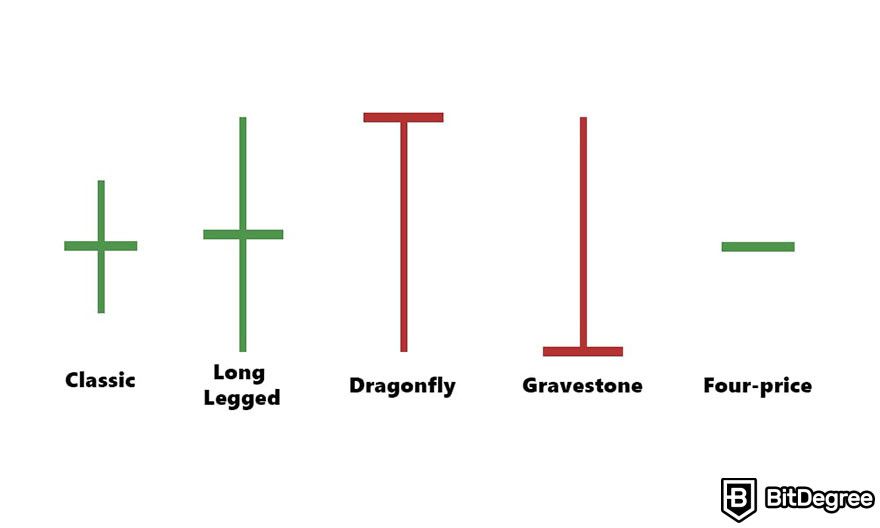
- Classic Doji: This is the most basic form, where the opening and closing prices are exactly the same or very close, forming a cross or plus sign. It signifies indecision.
- Long-Legged Doji: This variation has long upper and lower wicks, suggesting a wide range between the high and low prices during the trading period, but closes near the opening price, indicating a significant indecision or struggle between buyers and sellers.
- Dragonfly Doji: The Dragonfly Doji has a long lower wick and no upper wick, with the opening and closing prices at the top of the trading range. It often appears at the bottom of downtrends and can signal a potential bullish reversal, as it suggests buyers started to gain ground by the end of the period.
- Gravestone Doji: Unlike the Dragonfly, the Gravestone Doji has a long upper wick and no lower wick, with the opening and closing prices at the bottom of the trading range. It typically occurs at the top of uptrends and might indicate a bearish reversal, signaling that sellers were pushing back against the buyers.
- Four-Price Doji: Encountering a Four-Price Doji while you’re learning about how to read candlesticks can be a bit confusing at first because this pattern doesn’t seem to have a wick. This is where the open, close, high, and low prices are all the same, showing extreme indecision and equilibrium between buyers and sellers.
Hammer and Inverted Hammer
Imagine looking at a candlestick that looks a bit like a hammer you'd use to nail something into a wall. This is where the Hammer pattern gets its name. It has a short body at the top and a long wick at the bottom. The body can be either green or red, but what's important is that long wick sticking out below it.
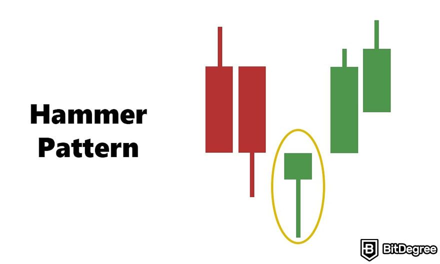
The Hammer typically appears during a downtrend. It suggests that although the price dropped during the period, by the end, buyers started to push back up, closing the session nearer to the opening price. Simply put, a Hammer candle chart pattern is a sign that the downtrend is losing steam and a reversal upward might be coming soon.
Now, flip that hammer upside down, and you get the Inverted Hammer. It's similar but not quite the same. The Inverted Hammer has a short body at the bottom with a long wick above it. Like the Hammer, its body can be green or red, but the key feature is the long upper wick.
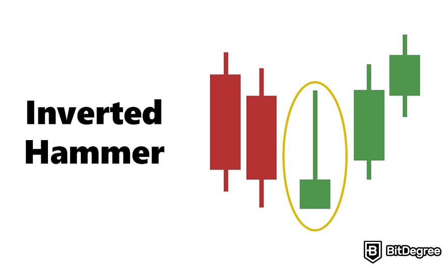
This pattern also commonly shows up during a downtrend. It indicates that during the period, prices shot up due to some buying pressure but then fell back down, closing not too far from where they opened. The appearance of an Inverted Hammer suggests that buyers are trying to take control from the sellers. If followed by a green candle, it could mean a bullish reversal is on the horizon.
The Hammer and the Inverted Hammer signal that the market sentiment might be changing. However, smart traders look for confirmation before making a move. For a Hammer, they want to see a green candlestick following it to confirm a potential upward trend. For an Inverted Hammer, they also look for a green candlestick next, as confirmation that buyers are indeed starting to dominate.
Shooting Star and Hanging Man
Similar to the Hammer and Inverted Hammer candlestick chart patterns, the Shooting Star and Hanging Man consist of a small body on either end of the wick. So how do you tell them apart? You’ll need to look at the market trend that precedes them.
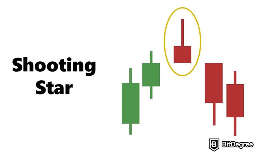
The Shooting Star pattern visually resembles the Inversed Hammer except it appears during an uptrend. It signals that during the period, prices spiked up but then fell back down, closing near where they started.
When traders see a Shooting Star, they typically take it as a warning that the uptrend might be running out of steam and a downward reversal could be coming. It indicates selling pressure is starting to overcome buying pressure.
On the other hand, the Hanging Man looks more like the Hammer pattern. It suggests that even though there was an attempt to push prices higher during the session, it closed near the open, indicating that selling pressure is starting to mount. The Hanging Man is also seen as a potential bearish reversal signal.
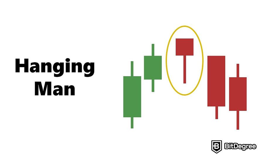
The Shooting Star and the Hanging Man patterns are used by traders to gauge potential shifts in market movements. But, it's crucial to wait for confirmation before acting on these signals. A candlestick that closes lower than these patterns can be a sign that a downward trend would continue.
Bullish and Bearish Engulfing
Imagine you're looking at a chart, and you see a small red candle followed by a much larger green candle. This larger green candle completely covers or "engulfs" the smaller red one. This is a Bullish Engulfing candle chart pattern.
This pattern shows up after a downtrend. The Bullish Engulfing pattern signals that the buyers are starting to outpower the sellers. The small red candle shows that sellers were still trying to push the price down, but then the big green candle appears, showing that buyers have come in strong and pushed the price up higher than it started the day before.
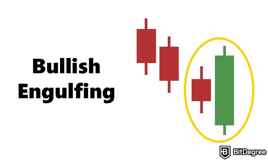
This pattern suggests that the trend might be about to change from going down to going up. Some traders see this as a potential sign to buy.
Now, picture the opposite. You see a small green candle followed by a much larger red candle. The red candle completely engulfs the green one. This is the Bearish Engulfing pattern. You'll find this pattern after prices have been rising.
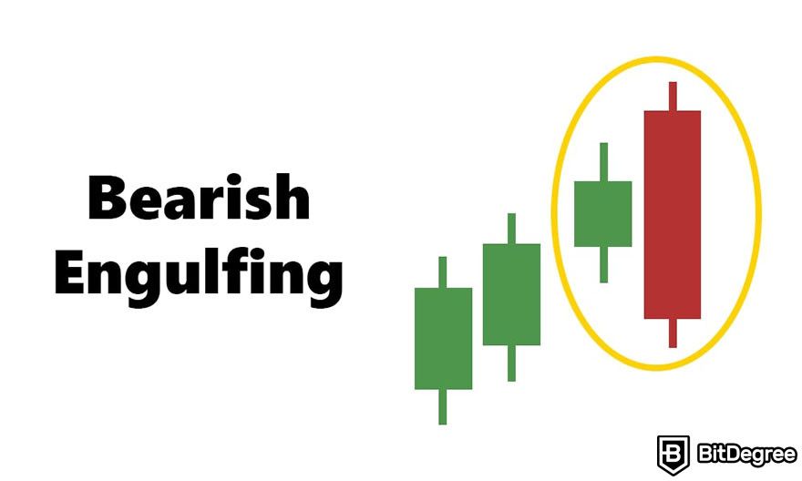
The Bearish Engulfing pattern indicates that sellers are taking control back from the buyers. The small green candle shows that buyers were trying to keep pushing the price up, but then the big red candle shows up, pushing the price down lower than it opened the day before. This pattern is a signal that the trend might be changing from going up to going down. It's often seen as a potential sign to sell.
Aside from knowing how to read candlesticks with Bullish and Bearish Engulfing patterns, smart traders would look for confirmation in the following days to make sure the new trend is actually starting. For the Bullish Engulfing, look for another green candle or other signs of continuing upward movement. For the Bearish Engulfing, pay attention to more red candles or downward trends.
It is also worth noting that these patterns are more significant when they appear after a clear up or down trend. If the market's been moving sideways, they might not be as reliable.
Morning and Evening Star
Morning Star and Evening Star patterns are like signals in the sky for traders, indicating potential changes in the market direction. They're a bit more complex because each involves three candles, but I'll break it down simply.
Think of the Morning Star pattern as the first light of dawn that signals the darkness (a downtrend) might be coming to an end, and brighter times (an uptrend) are ahead. Here's how it looks:
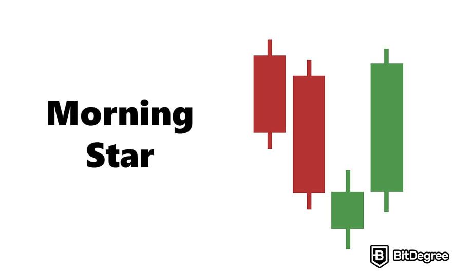
The pattern starts with a long red candle in a downtrend, which means the market was moving down that day. It is followed by a small candle or even a Doji, which appears gapped down from the first candle. This candle doesn't necessarily have a color requirement because it represents indecision or a pause in the market's movement.
The last part is a long green candle that opens gapped up from the second candle and closes at least halfway into the body of the first candle. This green candle is the key, showing that buyers are taking control and pushing the price up. Therefore, The Morning Star pattern is a bullish reversal signal. Traders often see this as a good time to consider buying.
Meanwhile, the Evening Star is like the first sign of dusk, suggesting that the daylight (an uptrend) might be fading, and darker times (a downtrend) could be ahead. Here's the setup:
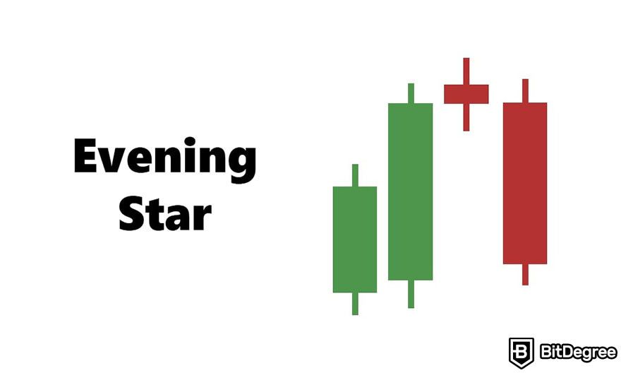
This pattern begins with a long green candle in an uptrend, indicating that prices were moving up on that day. The next is a small candle or Doji that opens gapped up from the first candle. Like the Morning Star, this candle represents a moment of indecision, showing that the upward momentum is potentially weakening.
The final candle is a long red one that opens gapped down from the second candle and closes at least halfway into the body of the first candle. This shows that sellers have taken control and are pushing the price down. The Evening Star candle chart pattern signals a bearish reversal. Traders might take this as a sign to sell or avoid buying.
Confirmation signs are also a big part of how to read candlesticks with these patterns. For the Morning Star, another green candle or bullish sign can confirm the uptrend. For the Evening Star, additional red candles or bearish indicators can confirm the downtrend.
Three White Soldiers
The Three White Soldiers pattern is a bullish candlestick formation that signals a strong reversal in the market, especially after a downtrend. Picture three soldiers standing in a row, ready to march forward; this is what the pattern looks like on a chart, with each "soldier" being a long, green (or white in traditional candlestick charts) candle. Here is how to read candlestick charts with this pattern:
The pattern starts with a long green candle. It appears after a period of downward movement in the market, suggesting the beginning of a potential change in sentiment from bearish to bullish. It is followed by another long green one.
The second candle usually opens within the body of the first candle and closes higher than the first candle’s close, reinforcing the idea that buyers are now in control. The final candle repeats the action of the second: a long green candle that opens within the body of the preceding candle and closes even higher. This third candle confirms the bullish trend, indicating strong buying pressure.
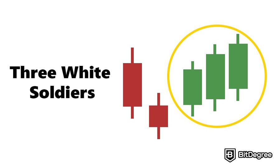
The Three White Soldiers pattern is considered a strong signal that a downtrend is reversing and an uptrend is starting. The "soldiers" march upward, showing buyers consistently pushing the price higher over three periods. This pattern tells traders that the market sentiment is becoming increasingly positive and that the bullish trend could continue.
While the Three White Soldiers pattern is a strong bullish signal, it's still important to look for confirmation before trading. This could be in the form of additional green candles following the pattern or other technical indicators that support a bullish outlook.
Ideally, each "soldier" should be accompanied by high trading volume, which provides further confirmation that the buying interest is strong and not just a temporary push.
But remember, you might see false confirmation signs while reading this candle chart pattern. Be cautious of situations where the market is overly extended or if the candles appear after a period of consolidation rather than a downtrend. In such cases, the pattern might not be as reliable.
Three Black Crows
The Three Black Crows pattern is the opposite of the Three White Soldiers pattern. It's a bearish signal, which means it suggests that prices might start to go down. Imagine three crows sitting on a fence, looking ominous; that's what this pattern looks like on a chart, with each "crow" being a long, red candle.
The pattern starts with a long red candle that appears after a period of upward movement in the market. This first candle is a hint that the market sentiment might be starting to shift from bullish to bearish. The next candle is also a long red one. It usually opens within the body of the first candle and closes lower than the first candle's close, further suggesting that sellers are gaining control.
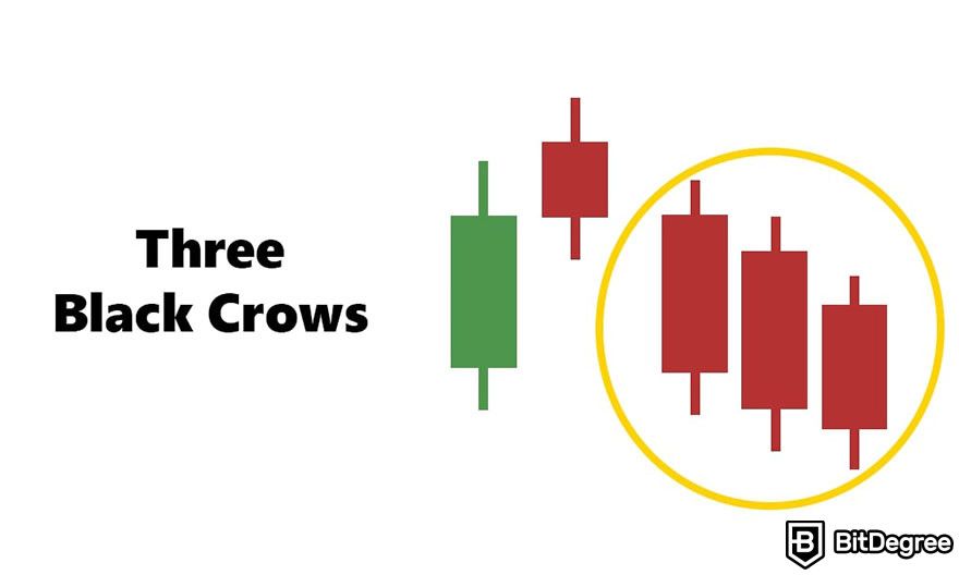
The final candle is yet another long red candle that opens within the body of the second candle and closes even lower. This third consecutive red candle confirms that there's strong selling pressure.
The Three Black Crows pattern signals a strong reversal from an uptrend to a downtrend. The "crows" are marching downwards, indicating that sellers keep lowering the prices across three periods. This pattern tells traders that the market sentiment is turning negative and that the bearish trend could continue.
To confirm this pattern, look for further downward movement following the pattern or other technical indicators. Ideally, the formation of each "crow" should be accompanied by high trading volume, providing more evidence of the strength behind the selling pressure.
Be careful in situations where the market might already be oversold, as the appearance of this pattern in such contexts could sometimes lead to a reversal back upwards. Always consider the broader market conditions.
Bullish and Bearish Harami
The Bullish Harami and Bearish Harami patterns are other popular reversal signal patterns you’d encounter while learning how to read candlesticks. The word "Harami" is a Japanese word that means "pregnant," which is a good way to remember these patterns because they sort of look like a pregnant silhouette.
For the Bullish Harami, imagine you're looking at a chart and you see a big red candle followed by a small green candle. The big red candle is like the "mother," and the small green candle is like the "baby," sitting snugly inside the body of the first candle. Here's the breakdown:
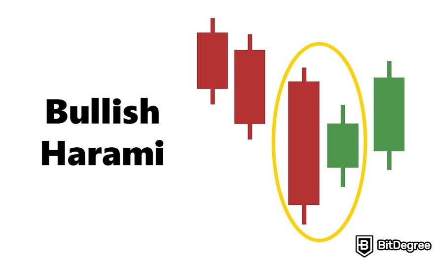
The pattern starts with a large red candle that appears during a downtrend. This candle shows that sellers were in control and pushed the price down. The next day, a small green candle appears, opening and closing within the range of the previous red candle's body. This suggests that the selling pressure is easing and buyers are starting to step in.
The Bullish Harami pattern signals a potential reversal from a downtrend to an uptrend. It's like the market taking a breath and possibly preparing to move in the opposite direction.
Now picture the opposite scenario: a big green candle followed by a small red candle. The big green candle is the "mother," and the small red candle is the "baby." This is the Bearish Harami candlestick chart pattern.
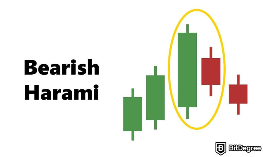
This pattern begins with a large green candle during an uptrend, indicating strong buying pressure that pushed the price up. Then, a small red candle appears, opening and closing within the range of the prior green candle's body. This suggests that the buying momentum is slowing and sellers are beginning to take control.
The Bearish Harami pattern indicates a potential reversal from an uptrend to a downtrend. It signals that the upward movement might be losing steam, and a change in direction could be on the horizon.
These candlestick chart patterns also have their own confirmation signals. For the Bullish Harami, look for further bullish signals in the following days, such as another green candle or a gap up (when the next day's opening price is higher than the high price of the previous day). For the Bearish Harami, seek additional bearish signals, like a red candle or a gap down.
Make sure to pay attention to trading volume. Higher volume on the Harami day or confirmation day can strengthen the signal.
Trading Candles - Strategies for Crypto Trading
Aside from knowing how to read candlesticks based on their visual patterns, crypto traders should know how to implement the information in their day-to-day trading activities. In this section, I'll go through the practical implementations of trading candles and how to optimize them using other indicators.
Note that if you'd like to acquire crypto easily, and without the need to trade it on complicated exchange platforms, Ogvio is the go-to service here - low-to-no fees, smooth UI, and the opportunity to earn some amazing rewards, while you're at it!
Using Candlesticks to Make Trading Decisions
Knowing how to read candlesticks is like having a map for your crypto trading journey. These trading candles can tell you about where prices might be headed, helping you decide when to jump in (entry points) and when to take your leave (exit points).
If you see a pattern like the Bullish Engulfing or Hammer after a downtrend, it's like the market is whispering, "Things might start looking up here." These patterns suggest that buyers are gaining strength, potentially leading to a price increase. It could be a good time to consider entering a trade.
On the other hand, candlestick patterns like the Bearish Engulfing or Three Black Crows appearing after a price increase can warn you of a potential downturn. It's as if the market is hinting, "The trend might change soon." These signs suggest selling pressure is mounting, which might be your cue to consider exiting a trade.
Knowing how to read candlestick patterns can help you see the bigger picture, beyond the daily ups and downs. By relying on the signals provided by candlestick patterns, you can make more informed decisions, reducing the chance of being swayed by emotions like fear or greed.
However, I need to emphasize that candlestick chart patterns are not foolproof. Some of the most popular patterns might even have low accuracy[1], so you will have to be more careful with your strategies and decisions when reading candles.

- Secure and reliable
- Accepts fiat currencies
- Lots of trading options
- Reputable exchange
- Accepts fiat currencies
- Offers various trading options

- Huge trading variety
- Regulation-compliant around the globe
- Fair trading fees
- Beginner-friendly
- A wide array of features
- Vast number of different crypto coins & tokens

- Beginner-friendly
- Secure
- Decent trading and withdrawal fees
- Crypto.com Visa Card
- Automated tools & bots
- Ecosystem synergy with CRO
Combining Candlestick Analysis with Other Indicators
The challenge for most traders isn't just learning how to read candlesticks, but also how to apply that knowledge in predicting future market trends accurately. One of the best ways to mitigate possible misinterpretation is by combining the information you got from trading charts with other technical indicators like Moving Averages (MAs) and Relative Strength Index (RSI).
MAs smooth out price data over a specific period and can help identify the trend direction. When a candlestick pattern suggests a potential reversal, see if the price is above or below a key moving average (like the 50-day or 200-day MA) to gauge the trend's strength.

Meanwhile, the RSI measures the magnitude of recent price changes to evaluate overbought or oversold conditions. A candlestick pattern that indicates a reversal might be more convincing if it is accompanied by an RSI reading below 30 (oversold) or above 70 (overbought)[2].
I also mentioned trading volume many times throughout this article. This is because volume is another essential part of how to read candlesticks, especially as a pattern confirmation signal.
High volume on a bullish reversal pattern means a lot of buyers are entering the market, adding credibility to the upward trend potential. Likewise, a high volume on a bearish pattern indicates strong selling pressure.
Last but not least, choosing the right crypto-exchange platform is also crucial to your trading success. Look for an exchange that offers an intuitive interface, smaller fees, better security measures, and wider cryptocurrency options. Some of the most popular exchanges I recommend are Binance, Kraken, and KuCoin.
Each of them has its unique strengths, but generally, they are easy to use with reliable security and plenty of cryptocurrencies to choose from. Perfect for beginners and expert crypto traders.
Conclusions
Learning how to read candlestick charts involves understanding the intricacy of the crypto market volatility and many common patterns. However, the time you spend will be worth it considering the amount of information candlestick charts offer.
In this article, we dove deeper into the basics of reading candles in crypto including understanding the anatomy and examining their differences with stock candlesticks. Patterns like Bullish Engulfing, Hanging Man, and Morning Star often represent an upcoming uptrend while Evening Star, Bearish Harami, and Three Black Crows can be seen as signs of a downtrend.
But remember that reading candles alone is not enough and these patterns don’t guarantee a certain market movement. Combining the information you got from reading candle charts with other technical indicators like MAs and RSI is important to strengthen your decision-making.
Don’t forget to also choose reliable crypto exchange platforms like Binance, Kraken, and KuCoin so you can implement your new knowledge of how to read candlesticks with no hassle, or go with Ogvio for a completely different approach to crypto. To be able to read candles properly requires time and many trials and errors. So keep practicing and trade responsibly.
The content published on this website is not aimed to give any kind of financial, investment, trading, or any other form of advice. BitDegree.org does not endorse or suggest you to buy, sell or hold any kind of cryptocurrency. Before making financial investment decisions, do consult your financial advisor.
Scientific References
1. Hon Ho K., Tin Chan T., Haoyuan P., et al.: “Do Candlestick Patterns Work in Cryptocurrency Trading?”;
2. Marek Z., Krzysztof Z., Piotr S.: “Effectiveness of the Relative Strength Index Signals in Timing the Cryptocurrency Market”.
