 HTML
HTML  CSS
CSS  PHP
PHP  JavaScript
  SQL
SQL  Bootstrap
  Solidity
  jQuery
  Git
Git  Chrome DevTools
  C++
C++  Python
 Bootstrap grid system is a very common technique used to create web layouts that recognize the size of the screen a visitor is using and adapt to it. This is extremely important nowadays when so many devices of various sizes can be easily connected to the Internet.
Using Bootstrap grid systems eliminates the fear of having your website displayed incorrectly on mobile phones or tablets - even if you created it on a personal computer with a widescreen monitor.
In this tutorial, we will explain how Bootstrap 4 columns and rows work and how to manipulate them to create a responsive layout for your modern website.
Contents
Bootstrap Grid System: Main Tips
- Bootstrap 4 grid system is an excellent way to create responsive layouts.
- The grid system offers a good range of options for making layouts respond to the screen size and provide good readability.
Bootstrap Columns
The grid system of Bootstrap 4 allows you to divide a row into 12 columns of equal width. However, these columns can also be combined to create columns that are wider and positioned differently. The grid can also be responsive and rearrange depending on the screen width or window size.
For example, you may want to display a three column layout on a computer screen. However, this can become difficult to view on a smaller screen, so you can make it to a single column grid with three columns stacked on top of one another. This can be done by assigning the appropriate responsive class to a column.
Classes
There are five classes in Bootstrap 4 which define the responsiveness of the grid element:
- .col-* -for screens narrower than 576px.
- .col-sm-* - for screens wider than 576px.
- .col-md-* - for screens wider than 768px.
- .col-lg-* - for screens wider than 992px.
- .col-xl-* - for screens wider than 1200px.
These classes can be combined so you can set layouts for different screen sizes.
Note: keep in mind that each of these classes scale up, not down. So if you need to specify a class for sm and bigger, you only have to specify it for sm.
- Easy to use with a learn-by-doing approach
- Offers quality content
- Gamified in-browser coding experience
- The price matches the quality
- Suitable for learners ranging from beginner to advanced
- Free certificates of completion
- Focused on data science skills
- Flexible learning timetable
- Simplistic design (no unnecessary information)
- High-quality courses (even the free ones)
- Variety of features
- Nanodegree programs
- Suitable for enterprises
- Paid Certificates of completion
- Easy to navigate
- No technical issues
- Seems to care about its users
- Huge variety of courses
- 30-day refund policy
- Free certificates of completion
Bootstrap Grid System Rules
To understand how the Bootstrap grid system is used, you must know the rules by which it functions:
- To create horizontal groups of elements, you have to create a .row class first. For the proper alignment and padding, these should be placed into .container or .container-fluid containers.
- Content is placed in columns that are placed in rows. Only columns should be direct children of .row containers.
- The columns create gaps between each other that are referred to as gutters. They are offset as negative margin in the first and last columns of the row. The gutters are typically 15px wide on both sides of the column.
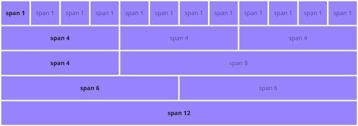
- You can create grid columns by specifying how many of the 12 available columns they should span.
- Column widths are all percentage values. This keeps them responsive and fluid.
Unlike Bootstrap 3, Bootstrap 4 uses flexbox instead of floats. This allows you to create equal columns without specifying their width. An example of this could be creating the containers with the .col-sm class, which would result in three columns with widths of 33.33%.
Grid Structure
Here we have a basic example of a Bootstrap grid structure:
<!-- Wrap in the row element -->
<div class="row">
<!-- The column elements inside the row -->
  <div class="col-*-*"></div>
  <div class="col-*-*"></div>
</div>

<!-- Wrap in the row element -->
<div class="row">
<!-- The column elements inside the row -->
  <div class="col"></div>
  <div class="col"></div>
</div>Let's examine this example in more detail:
- In both of the examples we see the columns wrapped inside a row element, as specified by the
"row"class. - In the first example, the column elements' classes are .col-*-*. The first
*symbol specifies the responsiveness level and could be replaced withsm,md,lgorxl. The second*symbol specifies how many columns this particular element should span across.
Note: Keep in mind that the number of columns the containers in a single row span across cannot exceed 12.
Options
Using the following table, you can easily check out the different layout building solutions that the Boostrap grid system offers:
| Extra small (under 576px) | Small (over 576px) | Medium (over 768px) | Large (over 992px) | Extra Large (over 1200px) | |
|---|---|---|---|---|---|
| Prefix | col- | col-sm- | col-md- | col-lg- | col-xl- |
| Grid behaviour | Always horizontal | Collapses at start, horizontal when above breakpoints | Collapses at start, horizontal when above breakpoints | Collapses at start, horizontal when above breakpoints | Collapses at start, horizontal when above breakpoints |
| Container width | auto (none) | 540px | 720px | 960px | 1140px |
| Suitable for | Phone screens in portrait mode | Phone screens in landscape mode | Tablet screens | Laptop screens | Laptop and Desktop screens |
In addition to that, all Bootstrap columns can be nested and offset. Column ordering is possible as well.
Bootstrap Grid System: Summary
- Creating Bootstrap layouts that respond to screen size can be made easy by using the Bootstrap grid system.
- A responsive layout makes the content easier to read.